
awesome_dialog
A new Flutter package project for simple and awesome dialogs
Usage
To use this package, add awesome_dialog as a dependency in your pubspec.yaml file.
And add this import to your file.
import ‘package:awesome_dialog/awesome_dialog.dart’;
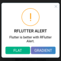
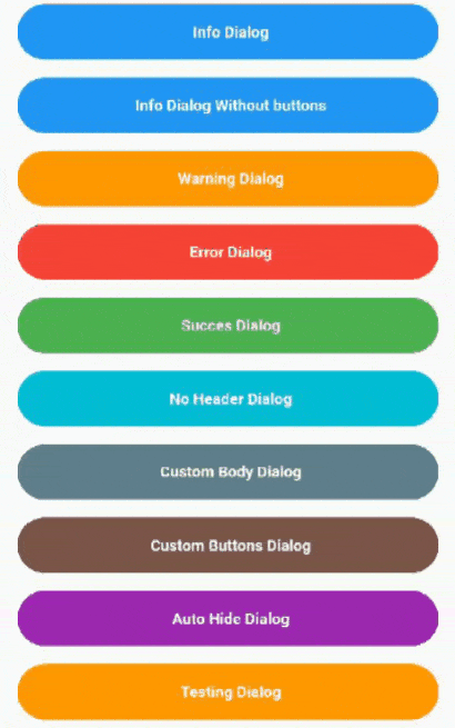
Image
Example
AwesomeDialog(
            context: context,
            dialogType: DialogType.INFO,
            animType: AnimType.BOTTOMSLIDE,
            title: 'Dialog Title',
            desc: 'Dialog description here.............',
            btnCancelOnPress: () {},
            btnOkOnPress: () {},
            )..show();
Custom Body
If the body is specified, then title and description will be ignored, this allows to further customize the dialogue.
AwesomeDialog(
            context: context,
            animType: AnimType.SCALE,
            dialogType: DialogType.INFO,
            body: Center(child: Text(
                    'If the body is specified, then title and description will be ignored, this allows to further customize the dialogue.',
                    style: TextStyle(fontStyle: FontStyle.italic),
                  ),),
            title: 'This is Ignored',
            desc:   'This is also Ignored',
            btnOkOnPress: () {},
                 )..show();
Custom Button
To use custom buttons, just specify the buttonOk or btnCancel widget, all text parameters icon etc will be ignored.
Dissmiss and Callback
AwesomeDialog has onDissmissCallback() and can be dissmissed at any time using dissmiss() public method.
AwesomeDialog Class
| Dart attribute | Datatype | Description | Default Value |
|---|---|---|---|
| dialogType | DialogType | Set DialogType example: DialogType.INFO, this create an animated Header. | Null |
| customHeader | Widget | Create your own header(if this is set DiaologType is ignored.) | Null |
| title | String | Set the title of dialog. | Null |
| desc | String | Set the description text of the dialog. | Null |
| body | Widget | Create your own Widget for body, if this property is set title and description will be ignored. | Null |
| context | BuildContext | @required | Null |
| btnOkText | String | Text of positive button | ‘Ok’ |
| btnOkIcon | IconData | Icon of positive button | Null |
| btnOkOnPress | Function | Function that handle click of postive Button, closing the dialog is handled internally. | Null |
| btnOkColor | Color | Color of postive Button | Color(0xFF00CA71) |
| btnOk | Widget | Allows to create a custom button, if this property is different from null then btnOkText, btnOkIcon, btnOkOnPress, btnOkColor will be ignored | null |
| btnCancelText | String | Text of negative button | ‘Cancel’ |
| btnCancelIcon | IconData | Icon of negative button | Null |
| btnCancelOnPress | Function | Function that handle click of negative Button, closing the dialog is handled internally. | Null |
| btnCancelColor | Color | Color of negative Button | Colors.red |
| btnCancel | Widget | Allows to create a custom button, if this property is different from null then btnCancelText, btnCancelIcon, btnCancelOnPress, btnCancelColor will be ignored | null |
| dismissOnTouchOutside | bool | Dissmiss dialog on touch overlay | true |
| onDissmissCallback | Function | Dissmiss callback funtion | Null |
| animType | AnimType | Type of dialogue enter animation | AnimType.SCALE |
| aligment | AlignmentGeometry | dialogue aligment gravity | Alignment.center |
| useRootNavigator | bool | Use the root navigator instead than the local. This is useful when the defaut cancel go to the previous screen instead to just close the dialog | false |
| headerAnimationLoop | bool | headerAnimationLoop control the loop for animation header | true |
| padding | EdgeInsetsGeometry | The padding of dialog elemets | EdgeInsets.only(left: 5, right: 5), |
| autoHide | Duration | Hide the Dialog after this Duration | null |
| keyboardAware | bool | Control if add or not the Padding EdgeInsets.only(bottom: MediaQuery.of(context).viewInsets.bottom). | true |
Source Code
Please Visit Show Dialog Flutter Source Code at GitHub