
RFlutter Alert
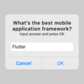
RFlutter Alert is super customizable and easy-to-use alert/popup dialogs for Flutter. You may create reusable alert styles or add buttons as much as you want with ease.


Features
- Single line basic alert
- Adding buttons dynamically (as much as you want)
- Predefined beautiful alert styles (success, error, warning, info)
- Reusable alert styles
- Super customizable
- Change animation (fromTop, fromBottom, fromRight, fromLeft, grow, shrink)
- Set animation duration
- Show/hide close button
- Set overlay tap to dismiss
- Assign Title and desc styles
- Change dialog border style
Getting started
You must add the library as a dependency to your project.
dependencies:
 rflutter_alert: ^1.0.3
You can also reference the git repo directly if you want:
dependencies:
 rflutter_alert:
   git: git://github.com/RatelHub/rflutter_alert.git
You should then run flutter packages get
Example Project
There is a detailed example project in the example folder. You can directly run and play on it. There are code snippets from example project below.
Basic Alert
Alert(context: context, title: "RFLUTTER", desc: "Flutter is awesome.").show();Alert with Button
    Alert(
      context: context,
      type: AlertType.error,
      title: "RFLUTTER ALERT",
      desc: "Flutter is more awesome with RFlutter Alert.",
      buttons: [
        DialogButton(
          child: Text(
            "COOL",
            style: TextStyle(color: Colors.white, fontSize: 20),
          ),
          onPressed: () => Navigator.pop(context),
          width: 120,
        )
      ],
    ).show();
Alert with Buttons
    Alert(
      context: context,
      type: AlertType.warning,
      title: "RFLUTTER ALERT",
      desc: "Flutter is more awesome with RFlutter Alert.",
      buttons: [
        DialogButton(
          child: Text(
            "FLAT",
            style: TextStyle(color: Colors.white, fontSize: 20),
          ),
          onPressed: () => Navigator.pop(context),
          color: Color.fromRGBO(0, 179, 134, 1.0),
        ),
        DialogButton(
          child: Text(
            "GRADIENT",
            style: TextStyle(color: Colors.white, fontSize: 20),
          ),
          onPressed: () => Navigator.pop(context),
          gradient: LinearGradient(colors: [
            Color.fromRGBO(116, 116, 191, 1.0),
            Color.fromRGBO(52, 138, 199, 1.0)
          ]),
        )
      ],
    ).show();
Alert with Style
AlertStyle
Use the AlertStyle class to customize.
    var alertStyle = AlertStyle(
      animationType: AnimationType.fromTop,
      isCloseButton: false,
      isOverlayTapDismiss: false,
      descStyle: TextStyle(fontWeight: FontWeight.bold),
      animationDuration: Duration(milliseconds: 400),
      alertBorder: RoundedRectangleBorder(
        borderRadius: BorderRadius.circular(0.0),
        side: BorderSide(
          color: Colors.grey,
        ),
      ),
      titleStyle: TextStyle(
        color: Colors.red,
      ),
    );
And assing your AlertStyle object to Alert’s style field.
    Alert(
      context: context,
      style: alertStyle,
      type: AlertType.info,
      title: "RFLUTTER ALERT",
      desc: "Flutter is more awesome with RFlutter Alert.",
      buttons: [
        DialogButton(
          child: Text(
            "COOL",
            style: TextStyle(color: Colors.white, fontSize: 20),
          ),
          onPressed: () => Navigator.pop(context),
          color: Color.fromRGBO(0, 179, 134, 1.0),
          radius: BorderRadius.circular(0.0),
        ),
      ],
    ).show();
Alert with Custom Image
    Alert(
      context: context,
      title: "RFLUTTER ALERT",
      desc: "Flutter is better with RFlutter Alert.",
      image: Image.asset("assets/success.png"),
    ).show();
Alert with Custom Content
    Alert(
        context: context,
        title: "LOGIN",
        content: Column(
          children: <Widget>[
            TextField(
              decoration: InputDecoration(
                icon: Icon(Icons.account_circle),
                labelText: 'Username',
              ),
            ),
            TextField(
              obscureText: true,
              decoration: InputDecoration(
                icon: Icon(Icons.lock),
                labelText: 'Password',
              ),
            ),
          ],
        ),
        buttons: [
          DialogButton(
            onPressed: () => Navigator.pop(context),
            child: Text(
              "LOGIN",
              style: TextStyle(color: Colors.white, fontSize: 20),
            ),
          )
        ]).show();
Contributions
- If you found a bug, open an issue.
- If you have a feature request, open an issue.
- If you want to contribute, submit a pull request.
Version compatability
See CHANGELOG for all breaking (and non-breaking) changes.
Main Contributor İzzet Öztürk
Made with ❤ by Ratel
Source Code
Please Visit Alert Dialog Flutter Source Code at GitHub