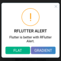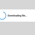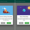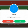
✨ flutter_custom_dialog
Global dialog function encapsulation, with a semantic way to fill the content inside the dialog, the current function provided
- Support for a few semantic component methods to populate the component content inside dialog
- Support for customizing semantic components for developers to freely populate component content inside dialog
- Support setting dialog background color, foreground color, position, animation, click the external disappear and other functions, see the details below
- Support no Context call dialog, see below
🎖 Installing
1、install
dependencies:
  flutter_custom_dialog: ^1.0.20
2、import
import 'package:flutter_custom_dialog/flutter_custom_dialog.dart';🎖 Example
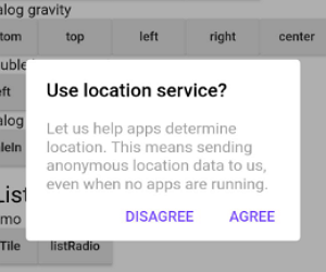
dialog_demo
 divider ✅ |
 body ✅ |
 head&body ✅ |
 listTile ✅ |
 ListRadio ✅ |
 progress ✅ |
 progress&body ✅ |
 bottom sheet ✅ |
 notice ✅ |
 pop menu ✅ Support for custom locations |
dialog_gravity
 bottom ✅ |
 top ✅ |
 left ✅ |
 right ✅ |
 center ✅ |
 left bottom ✅ |
 left top ✅ |
 right bottom ✅ |
 right top ✅ |
dialog_animation
 scaleIn ✅ |
 fadeIn ✅ |
 rotateIn ✅ |
 customIn ✅ Support for custom animations |
⚡ Dialog Property
dialog property Settings can be called through the method of member variables, as detailed in the following table
YYDialog YYNoticeDialog() {
  return YYDialog().build()
    ..width = 120
    ..height = 110
    ..backgroundColor = Colors.black.withOpacity(0.8)
    ..borderRadius = 10.0
    ..showCallBack = () {
      print("showCallBack invoke");
    }
    ..dismissCallBack = () {
      print("dismissCallBack invoke");
    }
    ..widget(Padding(
      padding: EdgeInsets.only(top: 21),
      child: Image.asset(
        'images/success.png',
        width: 38,
        height: 38,
      ),
    ))
    ..widget(Padding(
      padding: EdgeInsets.only(top: 10),
      child: Text(
        "Success",
        style: TextStyle(
          fontSize: 15,
          color: Colors.white,
        ),
      ),
    ))
    ..animatedFunc = (child, animation) {
      return ScaleTransition(
        child: child,
        scale: Tween(begin: 0.0, end: 1.0).animate(animation),
      );
    }
    ..show();
}
Supported attributes
| property | description | default |
|---|---|---|
| width | Dialog width | 0 |
| height | Dialog height | Adaptive component height |
| duration | Dialog animation time | 250 ms |
| gravity | Where the dialog appears | center |
| gravityAnimationEnable | The dialog appears with the default animation available | false |
| margin | The margin of a dialog | EdgeInsets.all(0.0) |
| barrierColor | Dialog barrierColor | 30% of black |
| decoration | Dialog decoration | null |
| backgroundColor | Dialog backgroundColor | white |
| borderRadius | Dialog borderRadius | 0.0 |
| constraints | Dialog constraints | no constraints |
| animatedFunc | Animation of dialog | Emerge from the middle |
| showCallBack | dialog show callbacks | not |
| dismissCallBack | dialog dismiss callbacks | not |
| barrierDismissible | Whether to click to pop up the external disappear | true |
| useRootNavigator | Whether to use root navigation | true |
- After setting gravity, set gravityAnimationEnable = true if animation is needed
- If the decoration property is set, the backgroundColor and borderRadius are not in effect; they are mutually exclusive
Supported method
| method | description |
|---|---|
| show[x,y] | show dialog |
| dismiss | dismiss dialog |
| isShowing | Is the dialog showing |
⚡ Semantic Widget
The contents of the components inside the dialog are encapsulated by semantic functions in advance to quickly build the dialog, as shown in the following table
YYDialog YYAlertDialogWithDivider(BuildContext context) {
  return YYDialog().build(context)
    ..width = 220
    ..borderRadius = 4.0
    ..text(
      padding: EdgeInsets.all(25.0),
      alignment: Alignment.center,
      text: "确定要退出登录吗?",
      color: Colors.black,
      fontSize: 14.0,
      fontWeight: FontWeight.w500,
    )
    ..divider()
    ..doubleButton(
      padding: EdgeInsets.only(top: 10.0),
      gravity: Gravity.center,
      withDivider: true,
      text1: "取消",
      color1: Colors.redAccent,
      fontSize1: 14.0,
      fontWeight1: FontWeight.bold,
      onTap1: () {
        print("取消");
      },
      text2: "确定",
      color2: Colors.redAccent,
      fontSize2: 14.0,
      fontWeight2: FontWeight.bold,
      onTap2: () {
        print("确定");
      },
    )
    ..show();
}
Semantic components supported
| method | description |
|---|---|
| text | text widget |
| doubleButton | two-button widget |
| listViewOfListTile | listTile widget |
| listViewOfRadioButton | listRadio widget |
| divider | divider widget |
| widget | custom semantic widget |
⚡ Custom Widget
Customize dialog interior component content
- Since the existing semantic components only assist in the rapid UI construction, they are far from meeting the requirements in actual project development
- So it provides the ability to insert custom semantic components into dialog
Insert the component into the dialog through ‘widget()’
YYDialog YYDialogDemo(BuildContext context) {
  return YYDialog().build(context)
    ..width = 220
    ..height = 500
    ..widget(
      Padding(
        padding: EdgeInsets.all(0.0),
        child: Align(
          alignment: Alignment.centerLeft,
          child: Text(
            "",
            style: TextStyle(
              color: Colors.black,
              fontSize: 14.0,
              fontWeight: FontWeight.w100,
            ),
          ),
        ),
      ),
    )
    ..show();
}
⚡ Without the Context to invoke
- Application scenario: after the network request comes back, there is no Context to refer to in the callback, at this time, the Context needs to be initialized in advance, and then the dialog can be called without the Context
1、init
Call static methods before show dialog YYDialog.init(context);
class AppHome extends StatelessWidget {
  Widget build(BuildContext context) {
    //1、init context
    YYDialog.init(context);
    //2、Subsequent use may not be required context
    ......
  }
}
2、use
direct use YYDialog,Note that it must be called build()
YYDialog YYAlertDialogBody() {
  return YYDialog().build()
    ..width = 240
    ..text(
      text: "Hello YYDialog",
      color: Colors.grey[700],
    )
    ..show();
}
🔥🔥 Attention
1、dismiss
- Do not use ‘Navigator.pop(context)’ to make the popover disappear, or you will close your page
- This problem has been solved internally in YYDialog, and you can simply call ‘dismiss()’ supplied internally
var yyDialog = YYDialog();
yyDialog?.dismiss();
Bugs/Requests
- If your application has problems, please submit your code and effect to Issue.
- Pull request are also welcome.
About
- QQ:510402535
- QQ群:798874340
- e-mail:xyj510402535@qq.com
- g-mail:xyj51042535@gmail.com
- Blog:http://blog.csdn.net/qq_30379689
- Github:https://github.com/AndroidHensen
License
Apache License 2.0
Source Code
Please Visit Flutter Custom Dialog Source Code at GitHub


