
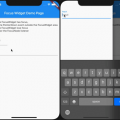
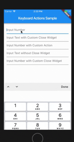
Keyboard Actions

Add features to the Android / iOS keyboard in a simple way.
Because the keyboard that Android / iOS offers us specifically when we are in numeric mode, does not bring the button to hide the keyboard.
This causes a lot of inconvenience for users, so this package allows adding functionality to the existing keyboard.
Features
- Done button for the keyboard (You can customize the button).
- Move up/down between your Textfields (You can hide for set
nextFocus: false). - Keyboard Bar customization.
- Custom footer widget below keyboard bar
- Create your own Keyboard in an easy way
- You can use it for Android, iOS or both platforms.
- Compatible with Dialog.
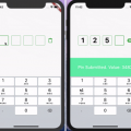
Example of the custom footer:

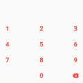
For more fun, use that widget as a custom keyboard with your custom input:

Even more fun:
Getting started
You should ensure that you add the dependency in your flutter project.
dependencies:
  keyboard_actions: "^3.1.2"
You should then run flutter packages upgrade or update your packages in IntelliJ.
Example Project
There is an example project in the example folder where you can get more information. Check it out. Otherwise, keep reading to get up and running.
Usage
import  'package:flutter/material.dart';
import  'package:keyboard_actions/keyboard_actions.dart';

class Content extends StatefulWidget {
  const Content({
    Key key,
  }) : super(key: key);

  @override
  _ContentState createState() => _ContentState();
}

class _ContentState extends State<Content> {
  final FocusNode _nodeText1 = FocusNode();
  final FocusNode _nodeText2 = FocusNode();
  final FocusNode _nodeText3 = FocusNode();
  final FocusNode _nodeText4 = FocusNode();
  final FocusNode _nodeText5 = FocusNode();
  final FocusNode _nodeText6 = FocusNode();

  /// Creates the [KeyboardActionsConfig] to hook up the fields
  /// and their focus nodes to our [FormKeyboardActions].
  KeyboardActionsConfig _buildConfig(BuildContext context) {
    return KeyboardActionsConfig(
      keyboardActionsPlatform: KeyboardActionsPlatform.ALL,
      keyboardBarColor: Colors.grey[200],
      nextFocus: true,
      actions: [
        KeyboardAction(
          focusNode: _nodeText1,
        ),
        KeyboardAction(
          focusNode: _nodeText2,
          closeWidget: Padding(
            padding: EdgeInsets.all(8.0),
            child: Icon(Icons.close),
          ),
        ),
        KeyboardAction(
          focusNode: _nodeText3,
          onTapAction: () {
            showDialog(
                context: context,
                builder: (context) {
                  return AlertDialog(
                    content: Text("Custom Action"),
                    actions: <Widget>[
                      FlatButton(
                        child: Text("OK"),
                        onPressed: () => Navigator.of(context).pop(),
                      )
                    ],
                  );
                });
          },
        ),
        KeyboardAction(
          focusNode: _nodeText4,
          displayCloseWidget: false,
        ),
        KeyboardAction(
          focusNode: _nodeText5,
          closeWidget: Padding(
            padding: EdgeInsets.all(5.0),
            child: Text("CLOSE"),
          ),
        ),
        KeyboardAction(
          focusNode: _nodeText6,
          footerBuilder: (_) => PreferredSize(
              child: SizedBox(
                  height: 40,
                  child: Center(
                    child: Text('Custom Footer'),
                  )),
              preferredSize: Size.fromHeight(40)),
        ),
      ],
    );
  }

  @override
  Widget build(BuildContext context) {
    return KeyboardActions(
      config: _buildConfig(context),
      child: Center(
        child: Padding(
          padding: const EdgeInsets.all(15.0),
          child: Column(
            crossAxisAlignment: CrossAxisAlignment.stretch,
            children: <Widget>[
              TextField(
                keyboardType: TextInputType.number,
                focusNode: _nodeText1,
                decoration: InputDecoration(
                  hintText: "Input Number",
                ),
              ),
              TextField(
                keyboardType: TextInputType.text,
                focusNode: _nodeText2,
                decoration: InputDecoration(
                  hintText: "Input Text with Custom Close Widget",
                ),
              ),
              TextField(
                keyboardType: TextInputType.number,
                focusNode: _nodeText3,
                decoration: InputDecoration(
                  hintText: "Input Number with Custom Action",
                ),
              ),
              TextField(
                keyboardType: TextInputType.text,
                focusNode: _nodeText4,
                decoration: InputDecoration(
                  hintText: "Input Text without Close Widget",
                ),
              ),
              TextField(
                keyboardType: TextInputType.number,
                focusNode: _nodeText5,
                decoration: InputDecoration(
                  hintText: "Input Number with Custom Close Widget",
                ),
              ),
              TextField(
                keyboardType: TextInputType.number,
                focusNode: _nodeText6,
                decoration: InputDecoration(
                  hintText: "Input Number with Custom Footer",
                ),
              ),
            ],
          ),
        ),
      ),
    );
  }
}
Using Custom Keyboard
import  'package:flutter/material.dart';
import  'package:keyboard_actions/keyboard_actions.dart';

class Content extends StatelessWidget {
  final FocusNode _nodeText7 = FocusNode();
  final FocusNode _nodeText8 = FocusNode();
  //This is only for custom keyboards
  final custom1Notifier = ValueNotifier<String>("0");
  final custom2Notifier = ValueNotifier<Color>(Colors.blue);

  /// Creates the [KeyboardActionsConfig] to hook up the fields
  /// and their focus nodes to our [FormKeyboardActions].
  KeyboardActionsConfig _buildConfig(BuildContext context) {
    return KeyboardActionsConfig(
      keyboardActionsPlatform: KeyboardActionsPlatform.ALL,
      keyboardBarColor: Colors.grey[200],
      nextFocus: true,
      actions: [
        KeyboardAction(
          focusNode: _nodeText7,
          footerBuilder: (_) => CounterKeyboard(
            notifier: custom1Notifier,
          ),
        ),
        KeyboardAction(
          focusNode: _nodeText8,
          footerBuilder: (_) => ColorPickerKeyboard(
            notifier: custom2Notifier,
          ),
        ),
      ],
    );
  }

  @override
  Widget build(BuildContext context) {
    return KeyboardActions(
      config: _buildConfig(context),
      child: Center(
        child: Container(
          padding: const EdgeInsets.all(15.0),
          child: Column(
            crossAxisAlignment: CrossAxisAlignment.stretch,
            children: <Widget>[
              KeyboardCustomInput<String>(
                focusNode: _nodeText7,
                height: 65,
                notifier: custom1Notifier,
                builder: (context, val, hasFocus) {
                  return Container(
                    alignment: Alignment.center,
                    color: hasFocus ? Colors.grey[300] : Colors.white,
                    child: Text(
                      val,
                      style:
                          TextStyle(fontSize: 30, fontWeight: FontWeight.bold),
                    ),
                  );
                },
              ),
              KeyboardCustomInput<Color>(
                focusNode: _nodeText8,
                height: 65,
                notifier: custom2Notifier,
                builder: (context, val, hasFocus) {
                  return Container(
                    width: double.maxFinite,
                    color: val ?? Colors.transparent,
                  );
                },
              ),
            ],
          ),
        ),
      ),
    );
  }
}

/// A quick example "keyboard" widget for picking a color.
class ColorPickerKeyboard extends StatelessWidget
    with KeyboardCustomPanelMixin<Color>
    implements PreferredSizeWidget {
  final ValueNotifier<Color> notifier;
  static const double _kKeyboardHeight = 200;

  ColorPickerKeyboard({Key key, this.notifier}) : super(key: key);

  @override
  Widget build(BuildContext context) {
    final double rows = 3;
    final double screenWidth = MediaQuery.of(context).size.width;
    final int colorsCount = Colors.primaries.length;
    final int colorsPerRow = (colorsCount / rows).ceil();
    final double itemWidth = screenWidth / colorsPerRow;
    final double itemHeight = _kKeyboardHeight / rows;

    return Container(
      height: _kKeyboardHeight,
      child: Wrap(
        children: <Widget>[
          for (final color in Colors.primaries)
            GestureDetector(
              onTap: () {
                updateValue(color);
              },
              child: Container(
                color: color,
                width: itemWidth,
                height: itemHeight,
              ),
            )
        ],
      ),
    );
  }

  @override
  Size get preferredSize => Size.fromHeight(_kKeyboardHeight);
}

/// A quick example "keyboard" widget for counter value.
class CounterKeyboard extends StatelessWidget
    with KeyboardCustomPanelMixin<String>
    implements PreferredSizeWidget {
  final ValueNotifier<String> notifier;

  CounterKeyboard({Key key, this.notifier}) : super(key: key);

  @override
  Size get preferredSize => Size.fromHeight(200);

  @override
  Widget build(BuildContext context) {
    return Container(
      height: preferredSize.height,
      child: Row(
        children: [
          Expanded(
            child: InkWell(
              onTap: () {
                int value = int.tryParse(notifier.value) ?? 0;
                value--;
                updateValue(value.toString());
              },
              child: FittedBox(
                child: Text(
                  "-",
                  style: TextStyle(
                    fontWeight: FontWeight.bold,
                  ),
                ),
              ),
            ),
          ),
          Expanded(
            child: InkWell(
              onTap: () {
                int value = int.tryParse(notifier.value) ?? 0;
                value++;
                updateValue(value.toString());
              },
              child: FittedBox(
                child: Text(
                  "+",
                  style: TextStyle(
                    fontWeight: FontWeight.bold,
                  ),
                ),
              ),
            ),
          ),
        ],
      ),
    );
  }
}
You can follow me on twitter @diegoveloper
Source Code
Visit Add features to the Android / iOS keyboard in a simple way at This Github Link