
sliding_up_panel


A draggable Flutter widget that makes implementing a SlidingUpPanel much easier! Based on the Material Design bottom sheet component, this widget works on both Android & iOS.
Installing
Add the following to your pubspec.yaml file:
dependencies:
  sliding_up_panel: ^1.0.2
Note that v1.0.0 introduced some breaking changes outlined below.
Simple Usage
There are two ways which the SlidingUpPanel can easily be added to your project.
- Using the
SlidingUpPanelas the root widget for the body (recommended). - Nesting the
SlidingUpPanel
SlidingUpPanel as the Root (recommended)
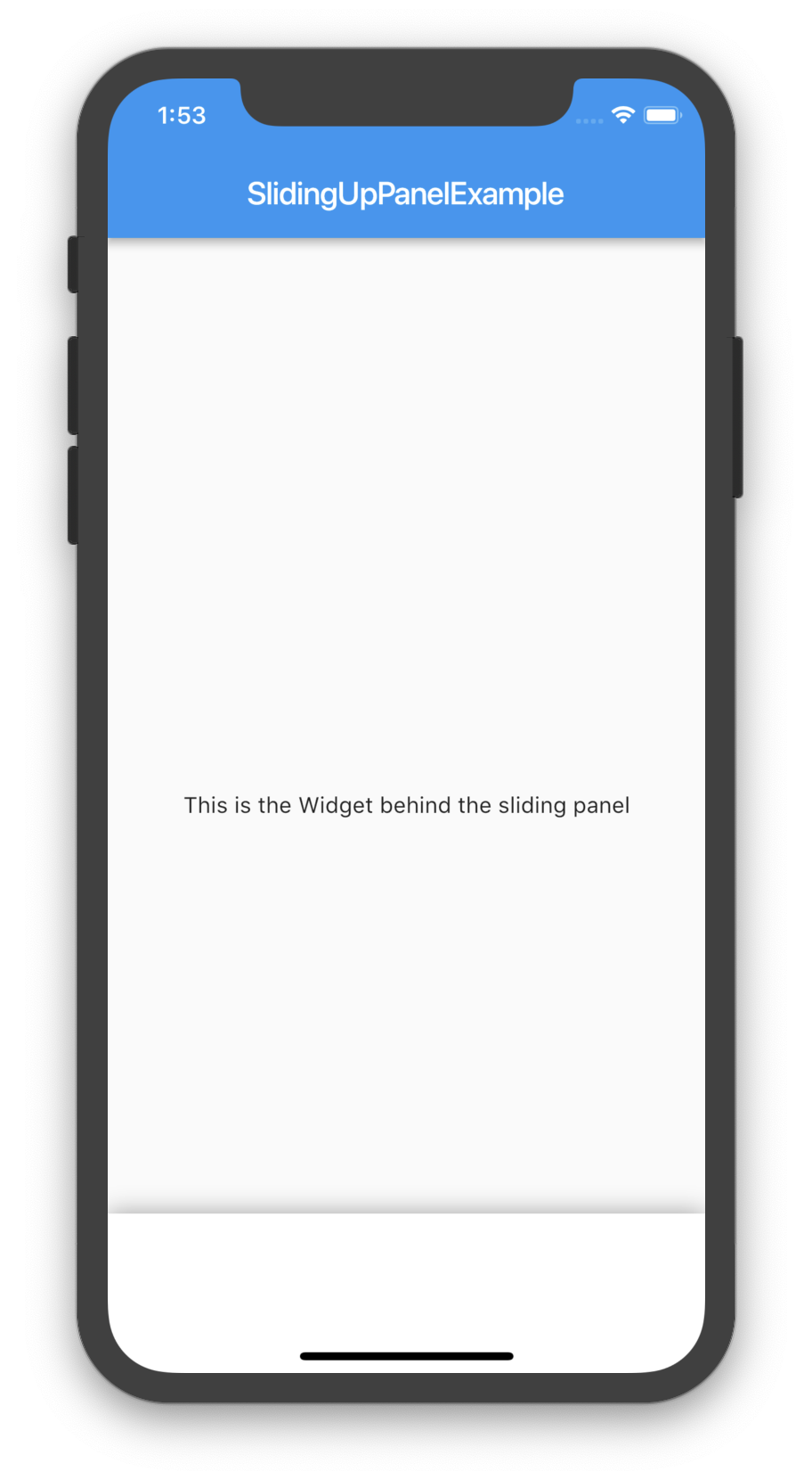
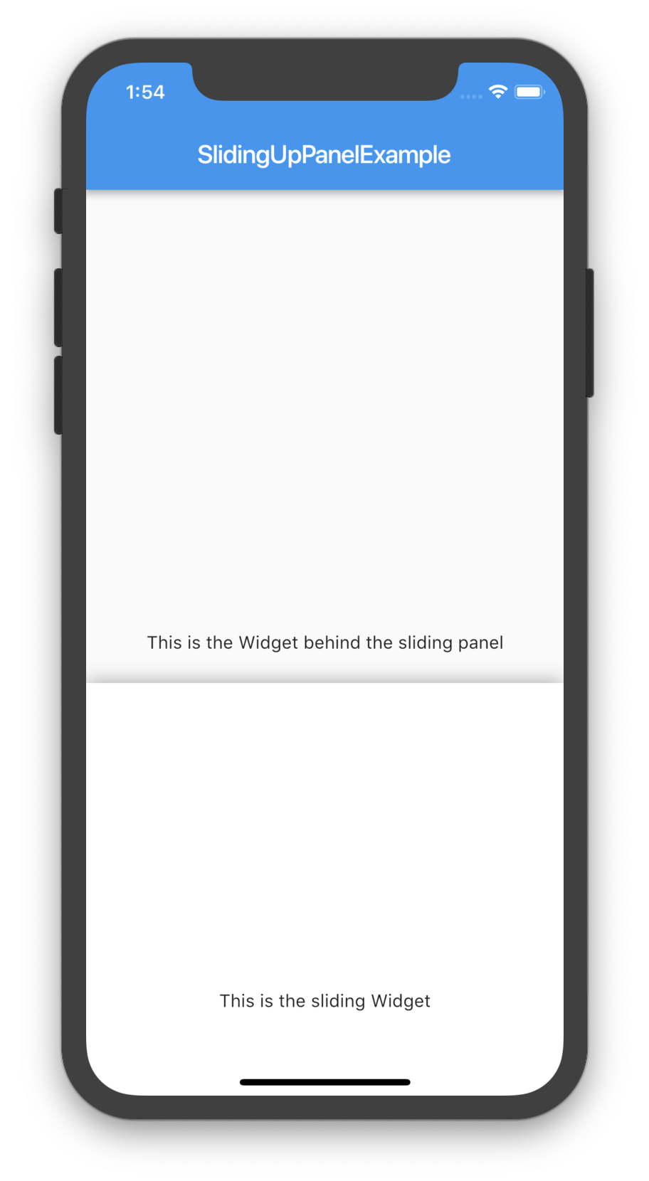
This method is recommended as it allows for the least interference with the behavior of other UI elements. For example:
@override
Widget build(BuildContext context) {
return Scaffold(
appBar: AppBar(
title: Text("SlidingUpPanelExample"),
),
body: SlidingUpPanel(
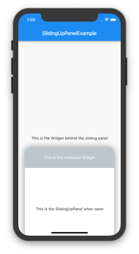
panel: Center(
child: Text("This is the sliding Widget"),
),
body: Center(
child: Text("This is the Widget behind the sliding panel"),
),
),
);
}Nesting the SlidingUpPanel
This method isn’t recommended but can still be used. Only use this to avoid refactoring large chunks of code or to implement custom scrolling behavior. For example, the SlidingUpPanel can be nested inside of a Stack (note that there are many other possible implementations that vary on a case-by-case basis).
@override
Widget build(BuildContext context) {
return Scaffold(
appBar: AppBar(
title: Text("SlidingUpPanelExample"),
),
body: Stack(
children: <Widget>[
Center(child: Text("This is the Widget behind the sliding panel"),),
SlidingUpPanel(
panel: Center(child: Text("This is the sliding Widget"),),
)
],
)
);
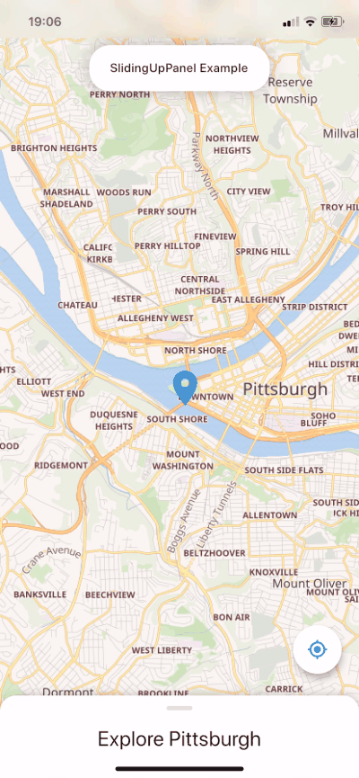
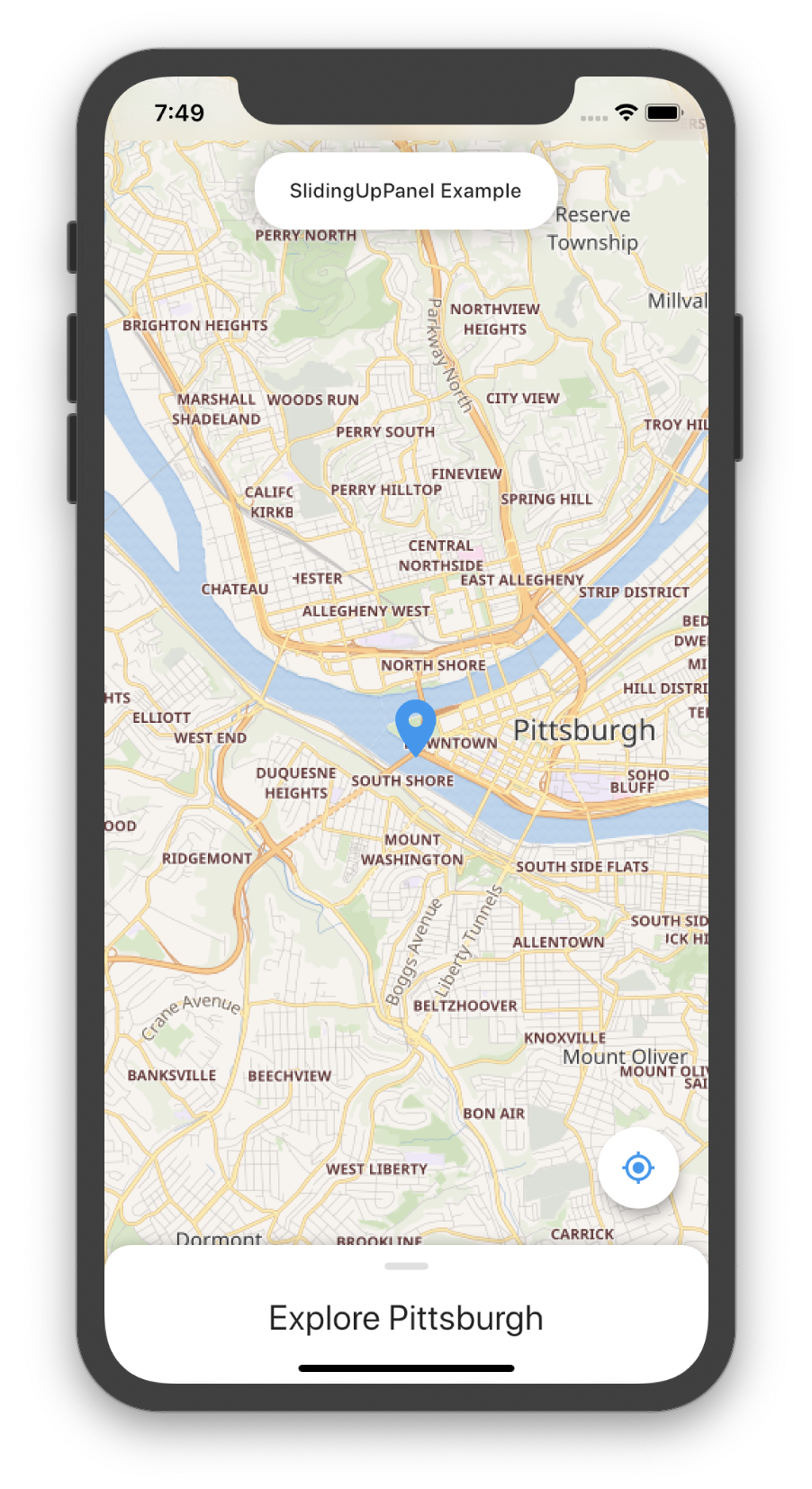
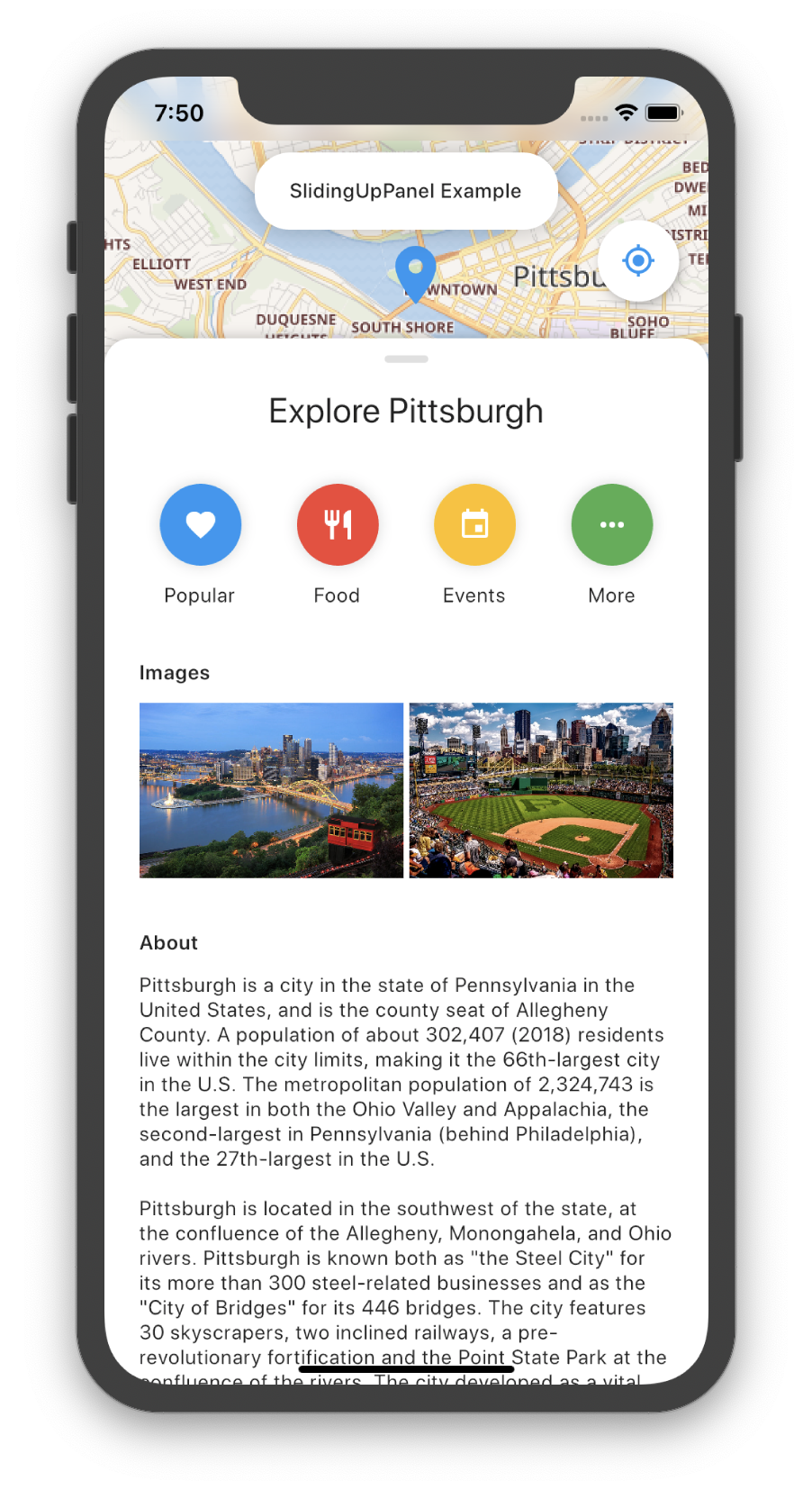
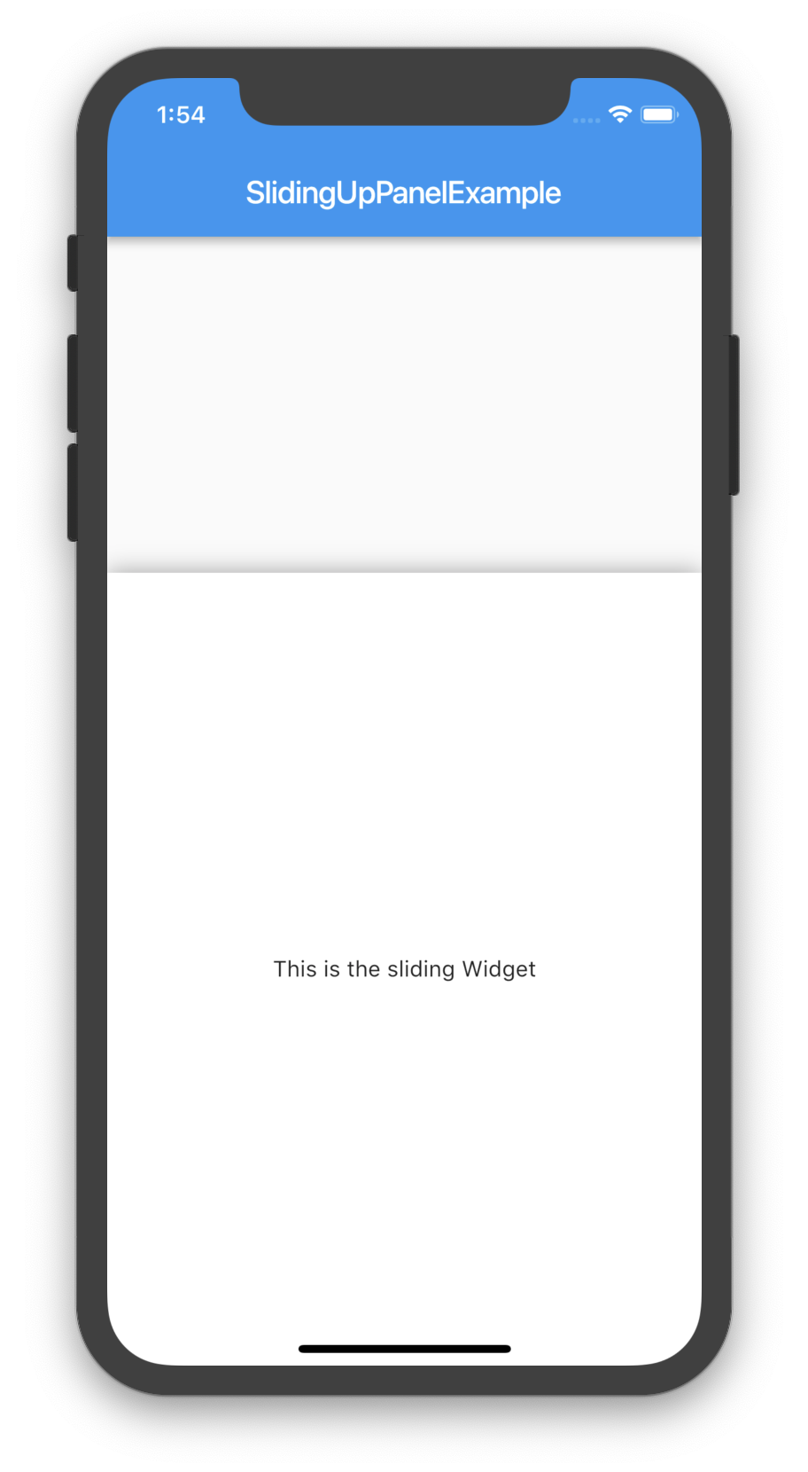
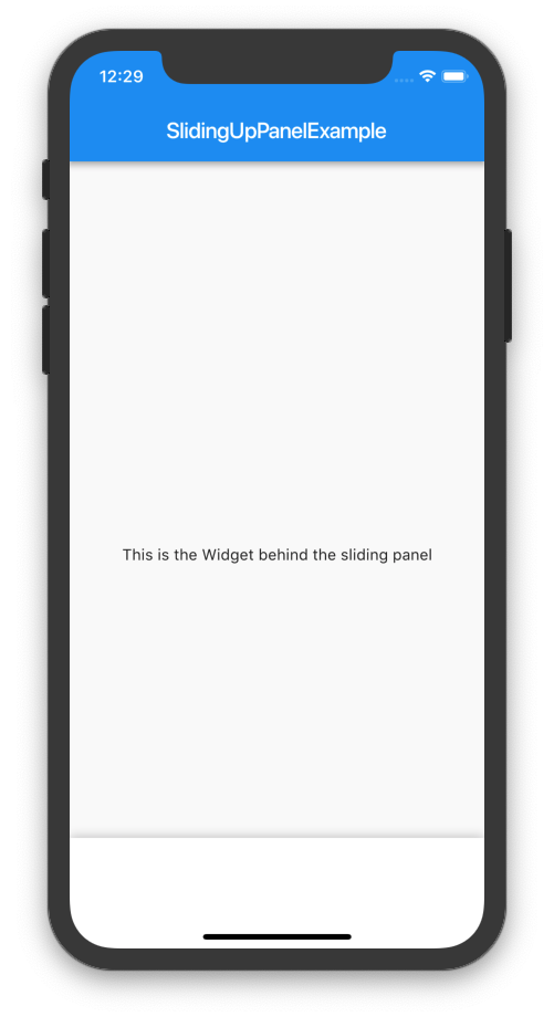
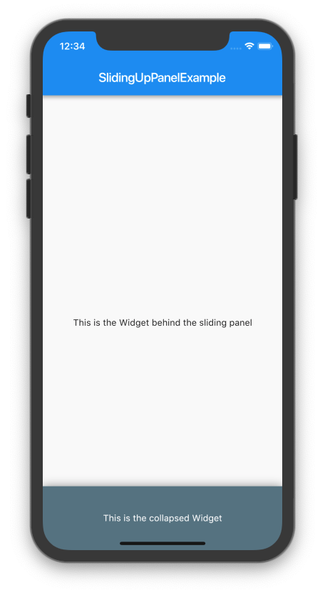
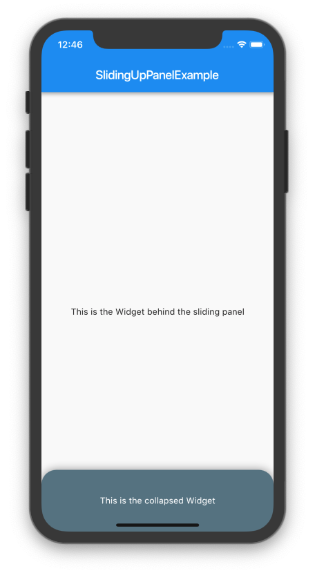
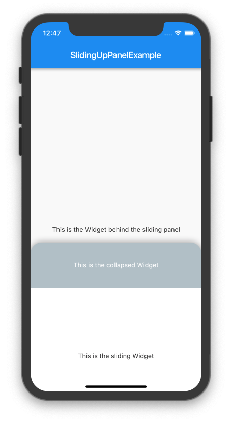
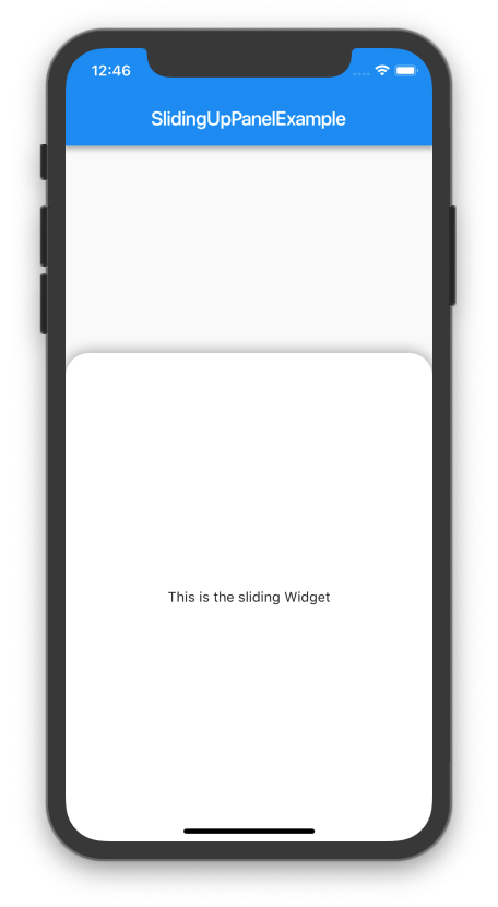
}Screenshots
Both methods produce the same result:
Custom Usage
There are several options that allow for more control:
| Properties | Description |
|---|---|
panel |
The Widget that slides into view. When the panel is collapsed and if collapsed is null, then top portion of this Widget will be displayed; otherwise, collapsed will be displayed overtop of this Widget. |
panelBuilder [beta] |
NOTE: This feature is still in beta and may have some problems. Please open an issue on GitHub if you encounter something unexpected.
Provides a |
collapsed |
The Widget displayed overtop the panel when collapsed. This fades out as the panel is opened. |
body |
The Widget that lies underneath the sliding panel. This Widget automatically sizes itself to fill the screen. |
header |
Optional persistent widget that floats above the panel and attaches to the top of the panel. Content at the top of the panel will be covered by this widget. Add padding to the top of the panel to avoid coverage. |
footer |
Optional persistent widget that floats above the panel and attaches to the bottom of the panel. Content at the bottom of the panel will be covered by this widget. Add padding to the bottom of the panel to avoid coverage. |
minHeight |
The height of the sliding panel when fully collapsed. |
maxHeight |
The height of the sliding panel when fully open. |
snapPoint [beta] |
NOTE: This feature is still in beta and may have some problems. Please open an issue on GitHub if you encounter something unexpected.
A point between |
border |
A border to draw around the sliding panel sheet. |
borderRadius |
If non-null, the corners of the sliding panel sheet are rounded by this. |
boxShadow |
A list of shadows cast behind the sliding panel sheet. |
color |
The color to fill the background of the sliding panel sheet. |
padding |
The amount to inset the children of the sliding panel sheet. |
margin |
Empty space surrounding the sliding panel sheet. |
renderPanelSheet |
Set to false to not to render the sheet the panel sits upon. This means that only body, collapsed, and the panel Widgets will be rendered. Set this to false if you want to achieve a floating effect or want more customization over how the sliding panel looks like. |
panelSnapping |
Set to false to disable the panel from snapping open or closed. |
backdropEnabled |
If non-null, shows a darkening shadow over the body as the panel slides open. |
backdropColor |
Shows a darkening shadow of this Color over the body as the panel slides open. |
backdropOpacity |
The opacity of the backdrop when the panel is fully open. This value can range from 0.0 to 1.0 where 0.0 is completely transparent and 1.0 is completely opaque. |
backdropTapClosesPanel |
Flag that indicates whether or not tapping the backdrop closes the panel. Defaults to true. |
controller |
If non-null, this can be used to control the state of the panel. |
onPanelSlide |
If non-null, this callback is called as the panel slides around with the current position of the panel. The position is a double between 0.0 and 1.0 where 0.0 is fully collapsed and 1.0 is fully open. |
onPanelOpened |
If non-null, this callback is called when the panel is fully opened. |
onPanelClosed |
If non-null, this callback is called when the panel is fully collapsed. |
parallaxEnabled |
If non-null and true, the SlidingUpPanel exhibits a parallax effect as the panel slides up. Essentially, the body slides up as the panel slides up. |
parallaxOffset |
Allows for specifying the extent of the parallax effect in terms of the percentage the panel has slid up/down. Recommended values are within 0.0 and 1.0 where 0.0 is no parallax and 1.0 mimics a one-to-one scrolling effect. Defaults to a 10% parallax. |
isDraggable |
Allows toggling of draggability of the SlidingUpPanel. Set this to false to prevent the user from being able to drag the panel up and down. Defaults to true. |
slideDirection |
Either SlideDirection.UP or SlideDirection.DOWN. Indicates which way the panel should slide. Defaults to UP. If set to DOWN, the panel attaches itself to the top of the screen and is fully opened when the user swipes down on the panel. |
defaultPanelState |
The default state of the panel; either PanelState.OPEN or PanelState.CLOSED. This value defaults to PanelState.CLOSED which indicates that the panel is in the closed position and must be opened. PanelState.OPEN indicates that by default the Panel is open and must be swiped closed by the user. |
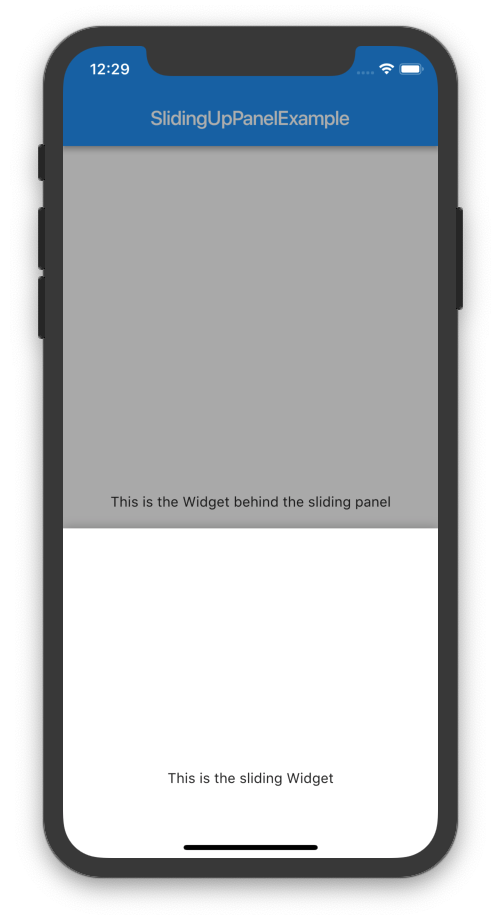
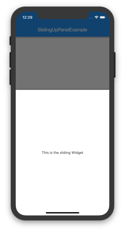
Darkening the Body as the Panel Opens
If desired, the body can be darkened as the panel is opened by setting backdropEnabled to true. You can also customize the backdropColor, backdropOpacity, and backdropTapClosesPanel. For example:
@override
Widget build(BuildContext context){
  return Material(
    child: SlidingUpPanel(
      backdropEnabled: true,
      panel: Center(
        child: Text("This is the sliding Widget"),
      ),
      body: Scaffold(
        appBar: AppBar(
          title: Text("SlidingUpPanelExample"),
        ),
        body:  Center(
          child: Text("This is the Widget behind the sliding panel"),
        ),
      ),
    ),
  );
}
Notice how the Scaffold is nested inside of the SlidingUpPanel. This because the backdrop is rendered only over the body of the SlidingUpPanel. As a result, if we want the backdrop to appear over the AppBar, then we must nest the Scaffold this way.
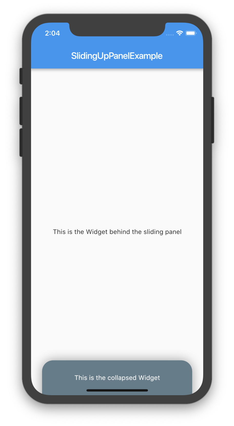
Displaying a Different Child When the Panel is Closed
By assigning a non-null Widget to the collapsed property, you can add a Widget that displays overtop the panel when collapsed. As the panel is opened, this Widget will fade out to display the panel underneath. For example:
@override
Widget build(BuildContext context) {
  return Scaffold(
    appBar: AppBar(
      title: Text("SlidingUpPanelExample"),
    ),
    body: SlidingUpPanel(
      panel: Center(
        child: Text("This is the sliding Widget"),
      ),
      collapsed: Container(
        color: Colors.blueGrey,
        child: Center(
          child: Text(
            "This is the collapsed Widget",
            style: TextStyle(color: Colors.white),
          ),
        ),
      ),
      body: Center(
        child: Text("This is the Widget behind the sliding panel"),
      ),
    ),
  );
}


Rounding the Borders
Modern design principles (especially in the Material Design Refresh) emphasize rounded borders. A similar effect can be easily achieved by providing a non-null BorderRadiusGeometry to the borderRadius property. Note that this only curves the border on the underlying panel sheet: any children passed to panel or collapsed must also have their borders curved separately in order to achieve a uniform effect. For example:
@override
Widget build(BuildContext context) {
  BorderRadiusGeometry radius = BorderRadius.only(
    topLeft: Radius.circular(24.0),
    topRight: Radius.circular(24.0),
  );

  return Scaffold(
    appBar: AppBar(
      title: Text("SlidingUpPanelExample"),
    ),
    body: SlidingUpPanel(
      panel: Center(
        child: Text("This is the sliding Widget"),
      ),

      collapsed: Container(
        decoration: BoxDecoration(
          color: Colors.blueGrey,
          borderRadius: radius
        ),
        child: Center(
          child: Text(
            "This is the collapsed Widget",
            style: TextStyle(color: Colors.white),
          ),
        ),
      ),

      body: Center(
        child: Text("This is the Widget behind the sliding panel"),
      ),

      borderRadius: radius,
    ),
  );
}
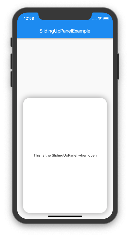
Creating A Floating Effect
To create a fully custom effect, the default panel sheet can be completely hidden and only the children rendered (i.e. only body, panel, and collapsed are rendered). To do this, set the renderPanelSheet property to false. For example, to create a floating effect:
@override
Widget build(BuildContext context) {
  return Scaffold(
    appBar: AppBar(
      title: Text("SlidingUpPanelExample"),
    ),
    body: SlidingUpPanel(
      renderPanelSheet: false,
      panel: _floatingPanel(),
      collapsed: _floatingCollapsed(),
      body: Center(
        child: Text("This is the Widget behind the sliding panel"),
      ),
    ),
  );
}

Widget _floatingCollapsed(){
  return Container(
    decoration: BoxDecoration(
      color: Colors.blueGrey,
      borderRadius: BorderRadius.only(topLeft: Radius.circular(24.0), topRight: Radius.circular(24.0)),
    ),
    margin: const EdgeInsets.fromLTRB(24.0, 24.0, 24.0, 0.0),
    child: Center(
      child: Text(
        "This is the collapsed Widget",
        style: TextStyle(color: Colors.white),
      ),
    ),
  );
}

Widget _floatingPanel(){
  return Container(
    decoration: BoxDecoration(
      color: Colors.white,
      borderRadius: BorderRadius.all(Radius.circular(24.0)),
      boxShadow: [
        BoxShadow(
          blurRadius: 20.0,
          color: Colors.grey,
        ),
      ]
    ),
    margin: const EdgeInsets.all(24.0),
    child: Center(
      child: Text("This is the SlidingUpPanel when open"),
    ),
  );
}
Note that a similar effect can be created by simply adding a margin to the SlidingUpPanel.
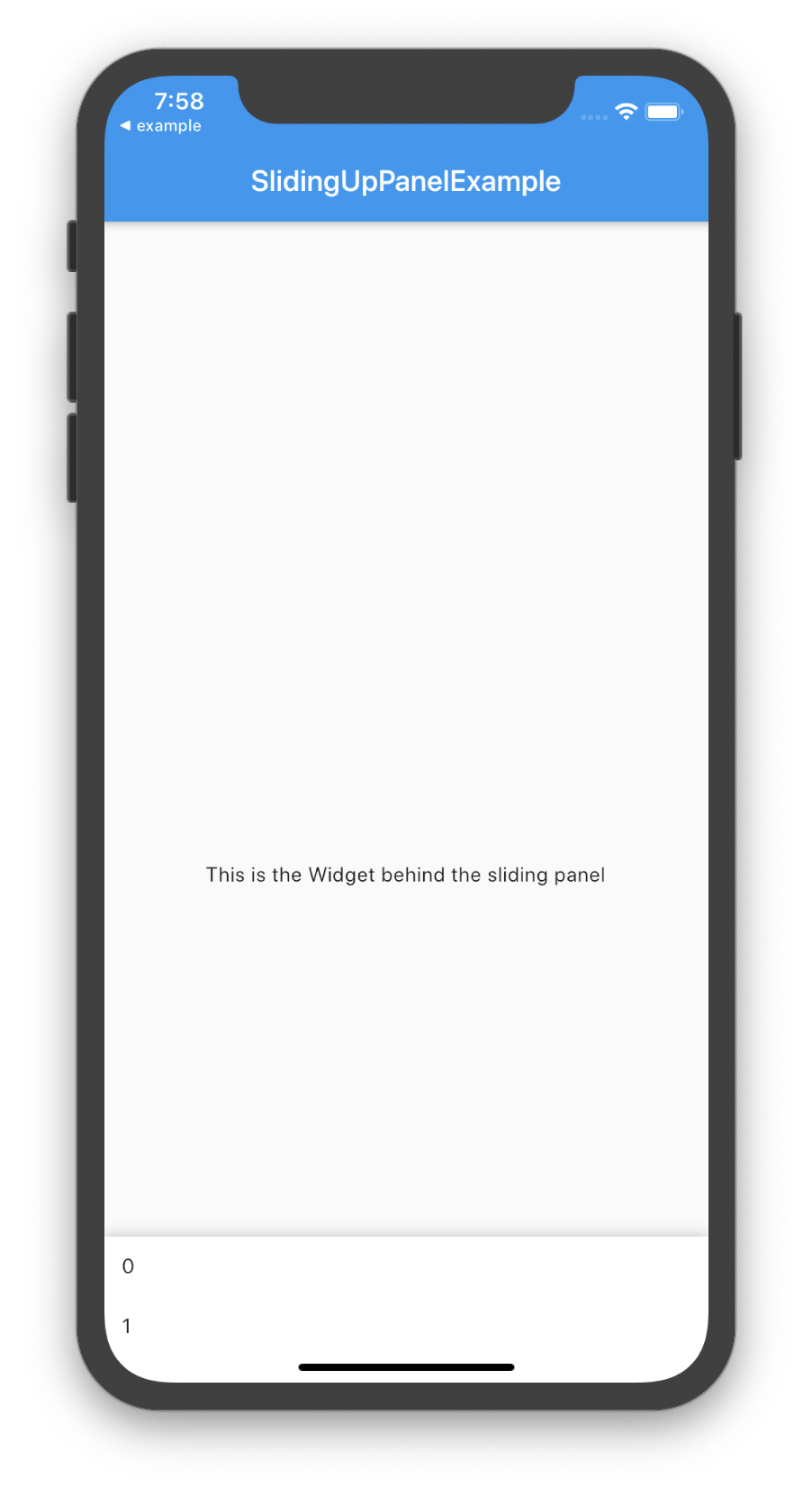
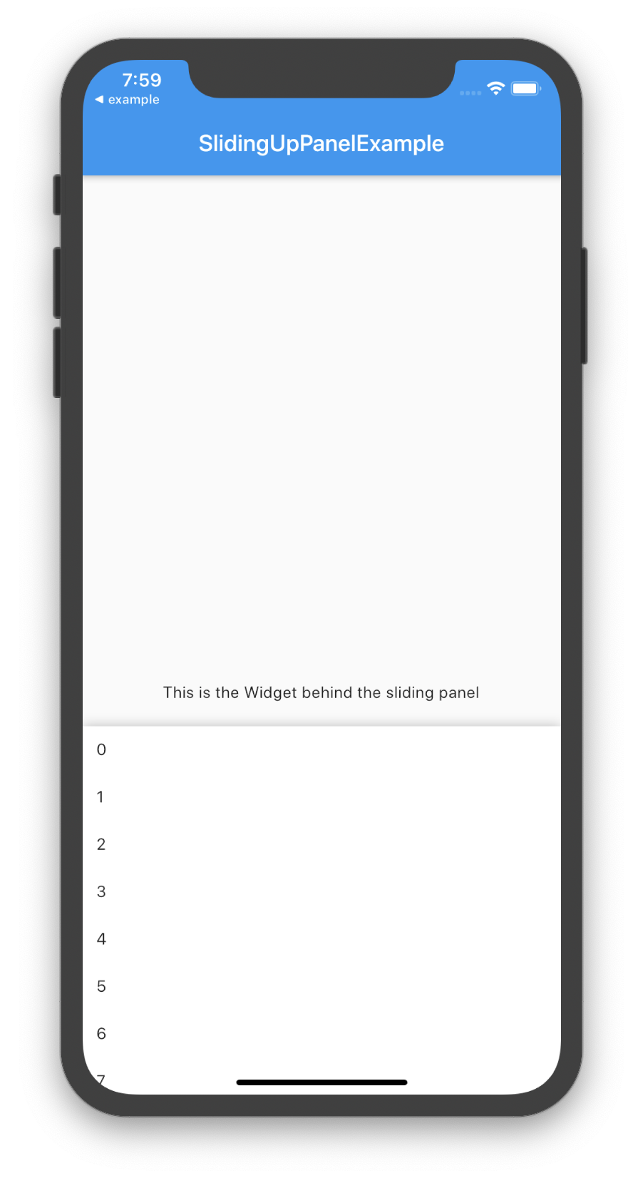
Adding Scrollable Elements to the Sliding Panel
The panel itself can contain Scrollable elements. As of v1.0.0, you can link the scroll position of the Scrollable elements with the position of the sliding up panel by using the panelBuilder. For example:
@override
Widget build(BuildContext context) {
  return Scaffold(
    appBar: AppBar(
      title: Text("SlidingUpPanelExample"),
    ),
    body: SlidingUpPanel(
      panelBuilder: (ScrollController sc) => _scrollingList(sc),
      body: Center(
        child: Text("This is the Widget behind the sliding panel"),
      ),
    ),
  );
}

Widget _scrollingList(ScrollController sc){
  return ListView.builder(
    controller: sc,
    itemCount: 50,
    itemBuilder: (BuildContext context, int i){
      return Container(
        padding: const EdgeInsets.all(12.0),
        child: Text("$i"),
      );
    },
  );
}

Using the PanelController
At times, it can be useful to manually change the state of the SlidingUpPanel. This can be easily achieved by using a PanelController and attaching it to an instance of the SlidingUpPanel. Note that since the PanelController modifies the state of a SlidingUpPanel, these methods can only be called after the SlidingUpPanel has been rendered.
| Properties | Data Type | Permissions | Description |
|---|---|---|---|
panelPosition |
double |
Read / Write | Evaluates to the current panel position (a value between 0.0 and 1.0) where 0.0 is closed and 1.0 is open. Any value assigned to this property must be between 0.0 and 1.0, inclusive. |
isAttached |
bool |
Read | Determine if the panelController is attached to an instance of the SlidingUpPanel (this property must be true before any other PanelController functions can be used) |
isPanelAnimating |
bool |
Read | Returns whether or not the panel is currently animating. |
isPanelOpen |
bool |
Read | Returns whether or not the panel is open. |
isPanelClosed |
bool |
Read | Returns whether or not the panel is collapsed. |
isPanelShown |
bool |
Read | Returns whether or not the panel is shown/hidden. |
| Methods | Return Type | Description |
|---|---|---|
open() |
Future<void> |
Opens the sliding panel fully (i.e. to the maxHeight) |
close() |
Future<void> |
Closes the sliding panel to its collapsed state (i.e. to the minHeight) |
hide() |
Future<void> |
Hides the sliding panel (i.e. is invisible) |
show() |
Future<void> |
Shows the sliding panel in its collapsed state (i.e. "un-hide" the sliding panel) |
animatePanelToPosition(double value, {Duration duration, Curve curve = Curves.linear}) |
Future<void> |
Animates the panel position to the value. The value must between 0.0 and 1.0 where 0.0 is fully collapsed and 1.0 is completely open. (optional) duration specifies the time for the animation to complete. (optional) curve specifies the easing behavior of the animation. |
animatePanelToSnapPoint(double value, {Duration duration, Curve curve = Curves.linear}) [beta] |
Future<void> |
NOTE: This feature is still in beta and may have some problems. Please open an issue on GitHub if you encounter something unexpected.
Animates the panel position to the snap point. Requires that the SlidingUpPanel |
PanelController _pc = new PanelController();

@override
Widget build(BuildContext context) {
  return Scaffold(
    appBar: AppBar(
      title: Text("SlidingUpPanelExample"),
    ),
    body: SlidingUpPanel(
      controller: _pc,
      panel: Center(
        child: Text("This is the sliding Widget"),
      ),
      body: _body(),
    ),
  );
}

Widget _body(){
  return Container(
    child: Column(
      children: <Widget>[
        RaisedButton(
          child: Text("Open"),
          onPressed: () => _pc.open(),
        ),
        RaisedButton(
          child: Text("Close"),
          onPressed: () => _pc.close(),
        ),
        RaisedButton(
          child: Text("Show"),
          onPressed: () => _pc.show(),
        ),
        RaisedButton(
          child: Text("Hide"),
          onPressed: () => _pc.hide(),
        ),
      ],
    ),
  );
}
Breaking Changes
v1.0.0 introduced some breaking changes to the PanelController to better adhere to Dart language conventions. The changes are outlined below.
The following PanelController methods now return Future<void> instead of void:
close()open()hide()show()animatePanelToPosition(double value)
The following PanelController methods have changed to Dart properties to better reflect Dart language conventions:
setPanelPosition()->panelPosition[as a setter]getPanelPosition()->panelPosition[as a getter]isPanelAnimating()->isPanelAnimatingisPanelOpen()->isPanelOpenisPanelClosed()->isPanelClosedisPanelShown()->isPanelShown
For example, here’s how you would have previously used setPanelPosition() and getPanelPosition() vs. how you would now use the panelPosition property:
// OLD, no longer supported
print(pc.getPanelPosition()); // print a value between 0.0 and 1.0
pc.setPanelPosition(0.5);     // sets the panelPosition to 0.5
// NEW
print(pc.panelPosition); // print a value between 0.0 and 1.0
pc.panelPosition = 0.5; // sets the panelPosition to 0.5And here’s how you would have previously called isPanelAnimating() vs. how you would now call isPanelAnimating.
panelController.isPanelAnimating(); // OLD, no longer supportedpanelController.isPanelAnimating; // NEWSource Code
Please Visit Sliding Up Panel Flutter Source Code at GitHub