
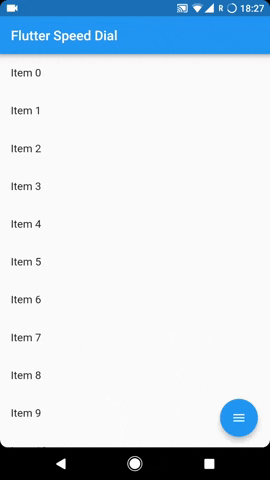
Flutter Speed Dial
Flutter package to render a Material Design Speed Dial.
Usage
The SpeedDial widget is built to be placed in the Scaffold.floatingActionButton argument, replacing the FloatingActionButton widget.
It’s not possible to set its position with the Scaffold.floatingActionButtonLocation argument, but it’s possible to set right/bottom margin with the marginRight and marginBottom arguments (default to 16) to place the button anywhere in the screen.
Using the Scaffold.bottomNavigationBar the floating button will be always placed above the bar, so the BottomAppBar.hasNotch should be always false.
Labels
Every child button can have a label, which can be customized providing a labelStyle. If the label parameter is not provided the label will be not rendered.
Animated Icon
The main floating action button child can set with the child parameter, however to make easier to use an AnimatedIcon there are two specific parameters:
animatedIcontakes anAnimatedIconDatawidgetanimatedIconThemetakes its theme
The package will handle the animation by itself.
Hide on Scroll
Another possibility is to make the button hide on scroll with a curve animation, with a visible parameter to set dynamically based on the scroll direction. See the example project for more info.
Example Usage ( complete with all params ):
Widget build(BuildContext context) {
    return Scaffold(
        floatingActionButton: SpeedDial(
          // both default to 16
          marginRight: 18,
          marginBottom: 20,
          animatedIcon: AnimatedIcons.menu_close,
          animatedIconTheme: IconThemeData(size: 22.0),
          // this is ignored if animatedIcon is non null
          // child: Icon(Icons.add),
          visible: _dialVisible,
          // If true user is forced to close dial manually
          // by tapping main button and overlay is not rendered.
          closeManually: false,
          curve: Curves.bounceIn,
          overlayColor: Colors.black,
          overlayOpacity: 0.5,
          onOpen: () => print('OPENING DIAL'),
          onClose: () => print('DIAL CLOSED'),
          tooltip: 'Speed Dial',
          heroTag: 'speed-dial-hero-tag',
          backgroundColor: Colors.white,
          foregroundColor: Colors.black,
          elevation: 8.0,
          shape: CircleBorder(),
          children: [
            SpeedDialChild(
              child: Icon(Icons.accessibility),
              backgroundColor: Colors.red,
              label: 'First',
              labelStyle: TextStyle(fontSize: 18.0),
              onTap: () => print('FIRST CHILD')
            ),
            SpeedDialChild(
              child: Icon(Icons.brush),
              backgroundColor: Colors.blue,
              label: 'Second',
              labelStyle: TextStyle(fontSize: 18.0),
              onTap: () => print('SECOND CHILD'),
            ),
            SpeedDialChild(
              child: Icon(Icons.keyboard_voice),
              backgroundColor: Colors.green,
              label: 'Third',
              labelStyle: TextStyle(fontSize: 18.0),
              onTap: () => print('THIRD CHILD'),
            ),
          ],
        ),
    );
}
Issues & Feedback
Please file an issue to send feedback or report a bug. Thank you!
Contributing
Every pull request is welcome.
Source Code
Please Visit Flutter Speed Dial Source Code at GitHub