
searchable_dropdown
Widget to let the user search through a keyword string typed on a customizable keyboard in a single or multiple choices list presented as a dropdown in a dialog box or a menu.
Platforms
This widget has been successfully tested on iOS, Android and Chrome.
Examples
The following examples are extracted from the example project available in the repository.
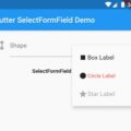
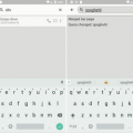
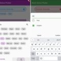
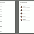
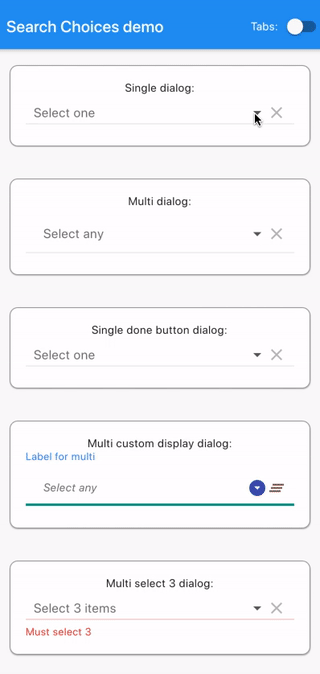
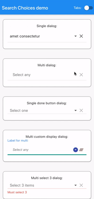
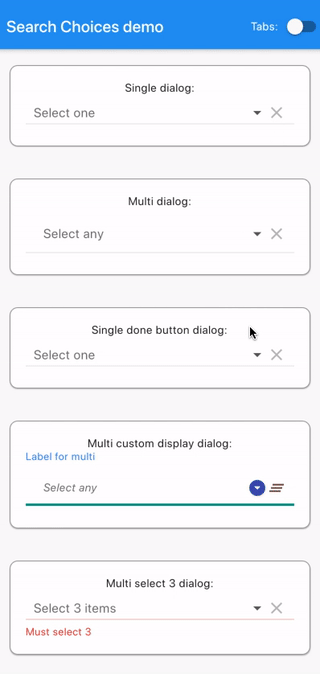
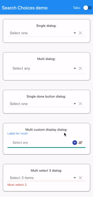
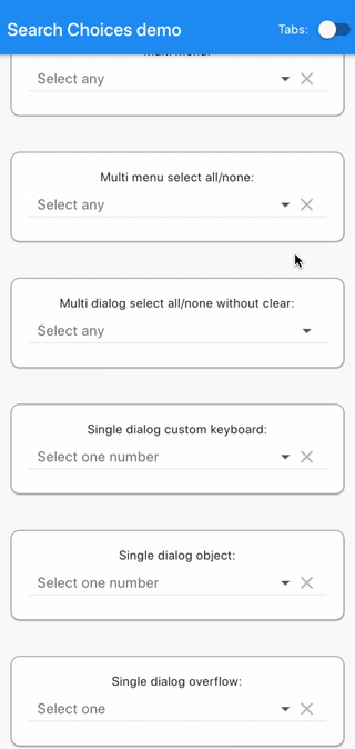
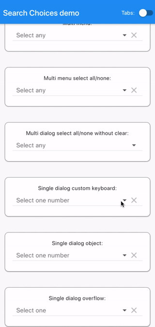
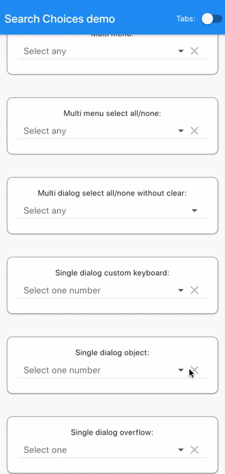
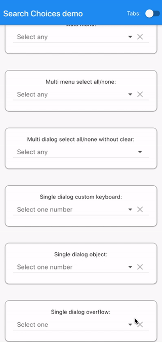
Gallery
See code below.
Code
Plugin usage
Add to your pubspec.yaml in the dependencies section:
searchable_dropdown:Get packages with command:
flutter packages getImport:
import 'package:searchable_dropdown/searchable_dropdown.dart';Call either the single choice or the multiple choice constructor.
Single choice constructor
Search choices Widget with a single choice that opens a dialog or a menu to let the user do the selection conveniently with a search.
factory SearchableDropdown.single({
    Key key,
    @required List<DropdownMenuItem<T>> items,
    @required Function onChanged,
    T value,
    TextStyle style,
    dynamic searchHint,
    dynamic hint,
    dynamic disabledHint,
    dynamic icon = const Icon(Icons.arrow_drop_down),
    dynamic underline,
    dynamic doneButton,
    dynamic label,
    dynamic closeButton = "Close",
    bool displayClearIcon = true,
    Icon clearIcon = const Icon(Icons.clear),
    Color iconEnabledColor,
    Color iconDisabledColor,
    double iconSize = 24.0,
    bool isExpanded = false,
    bool isCaseSensitiveSearch = false,
    Function searchFn,
    Function onClear,
    Function selectedValueWidgetFn,
    TextInputType keyboardType = TextInputType.text,
    Function validator,
    bool assertUniqueValue = true,
    Function displayItem,
    bool dialogBox = true,
    BoxConstraints menuConstraints,
    bool readOnly: false,
    Color menuBackgroundColor,
}
)- items with child: Widget displayed ; value: any object with .toString() used to match search keyword.
- onChanged Function with parameter: value not returning executed after the selection is done.
- value value to be preselected.
- style used for the hint if it is given is String.
- searchHint String|Widget|Function with no parameter returning String|Widget displayed at the top of the search dialog box.
- hint String|Widget|Function with no parameter returning String|Widget displayed before any value is selected or after the selection is cleared.
- disabledHint String|Widget|Function with no parameter returning String|Widget displayed instead of hint when the widget is displayed.
- icon String|Widget|Function with parameter: value returning String|Widget displayed next to the selected item or the hint if none.
- underline String|Widget|Function with parameter: value returning String|Widget displayed below the selected item or the hint if none.
- doneButton String|Widget|Function with parameter: value returning String|Widget displayed at the top of the search dialog box.
- label String|Widget|Function with parameter: value returning String|Widget displayed above the selected item or the hint if none.
- closeButton String|Widget|Function with parameter: value returning String|Widget displayed at the bottom of the search dialog box.
- displayClearIcon whether or not to display an icon to clear the selected value.
- clearIcon Icon to be used for clearing the selected value.
- iconEnabledColor Color to be used for enabled icons.
- iconDisabledColor Color to be used for disabled icons.
- iconSize for the icons next to the selected value (icon and clearIcon).
- isExpanded can be necessary to avoid pixel overflows (zebra symptom).
- isCaseSensitiveSearch only used when searchFn is not specified.
- searchFn Function with parameters: keyword, items returning List
as the list of indexes for the items to be displayed. - onClear Function with no parameter not returning executed when the clear icon is tapped.
- selectedValueWidgetFn Function with parameter: item returning Widget to be used to display the selected value.
- keyboardType used for the search.
- validator Function with parameter: value returning String displayed below selected value when not valid and null when valid.
- assertUniqueValue whether to run a consistency check of the list of items.
- displayItem Function with parameters: item, selected returning Widget to be displayed in the search list.
- dialogBox whether the search should be displayed as a dialog box or as a menu below the selected value if any.
- menuConstraints BoxConstraints used to define the zone where to display the search menu. Example: BoxConstraints.tight(Size.fromHeight(250)) . Not to be used for dialogBox = true.
- readOnly bool whether to let the user choose the value to select or just present the selected value if any.
- menuBackgroundColor Color background color of the menu whether in dialog box or menu mode.
Multiple choice constructor
Search choices Widget with a multiple choice that opens a dialog or a menu to let the user do the selection conveniently with a search.
SearchableDropdown<T>.multiple(
{
    Key key,
    @required List<DropdownMenuItem<T>> items,
    @required Function onChanged,
    List<int> selectedItems: const [],
    TextStyle style,
    dynamic searchHint,
    dynamic hint,
    dynamic disabledHint,
    dynamic icon: const Icon(Icons.arrow_drop_down),
    dynamic underline,
    dynamic doneButton: "Done",
    dynamic label,
    dynamic closeButton: "Close",
    bool displayClearIcon: true,
    Icon clearIcon: const Icon(Icons.clear),
    Color iconEnabledColor,
    Color iconDisabledColor,
    double iconSize: 24.0,
    bool isExpanded: false,
    bool isCaseSensitiveSearch: false,
    Function searchFn,
    Function onClear,
    Function selectedValueWidgetFn,
    TextInputType keyboardType: TextInputType.text,
    Function validator,
    Function displayItem,
    bool dialogBox: true,
    BoxConstraints menuConstraints,
    bool readOnly: false,
    Color menuBackgroundColor,
}
)- items with child: Widget displayed ; value: any object with .toString() used to match search keyword.
- onChanged Function with parameter: selectedItems not returning executed after the selection is done.
- selectedItems indexes of items to be preselected.
- style used for the hint if it is given is String.
- searchHint String|Widget|Function with no parameter returning String|Widget displayed at the top of the search dialog box.
- hint String|Widget|Function with no parameter returning String|Widget displayed before any value is selected or after the selection is cleared.
- disabledHint String|Widget|Function with no parameter returning String|Widget displayed instead of hint when the widget is displayed.
- icon String|Widget|Function with parameter: selectedItems returning String|Widget displayed next to the selected items or the hint if none.
- underline String|Widget|Function with parameter: selectedItems returning String|Widget displayed below the selected items or the hint if none.
- doneButton String|Widget|Function with parameter: selectedItems returning String|Widget displayed at the top of the search dialog box. Cannot be null in multiple selection mode.
- label String|Widget|Function with parameter: selectedItems returning String|Widget displayed above the selected items or the hint if none.
- closeButton String|Widget|Function with parameter: selectedItems returning String|Widget displayed at the bottom of the search dialog box.
- displayClearIcon whether or not to display an icon to clear the selected values.
- clearIcon Icon to be used for clearing the selected values.
- iconEnabledColor Color to be used for enabled icons.
- iconDisabledColor Color to be used for disabled icons.
- iconSize for the icons next to the selected values (icon and clearIcon).
- isExpanded can be necessary to avoid pixel overflows (zebra symptom).
- isCaseSensitiveSearch only used when searchFn is not specified.
- searchFn Function with parameters: keyword, items returning List
as the list of indexes for the items to be displayed. - onClear Function with no parameter not returning executed when the clear icon is tapped.
- selectedValueWidgetFn Function with parameter: item returning Widget to be used to display the selected values.
- keyboardType used for the search.
- validator Function with parameter: selectedItems returning String displayed below selected values when not valid and null when valid.
- displayItem Function with parameters: item, selected returning Widget to be displayed in the search list.
- dialogBox whether the search should be displayed as a dialog box or as a menu below the selected values if any.
- menuConstraints BoxConstraints used to define the zone where to display the search menu. Example: BoxConstraints.tight(Size.fromHeight(250)) . Not to be used for dialogBox = true.
- readOnly bool whether to let the user choose the value to select or just present the selected value if any.
- menuBackgroundColor Color background color of the menu whether in dialog box or menu mode.
Example app usage
Clone repository:
git clone https://github.com/icemanbsi/searchable_dropdown.gitGo to plugin folder:
cd searchable_dropdownOptionally enable web:
flutter config --enable-webCreate project:
flutter create .To run automated tests:
flutter testOptionally generate documentation:
pub global activate dartdoc
dartdoc
Go to example app folder:
cd exampleTo run web:
run -d chromeTo build web to folder build/web:
flutter build webTo run on a connected device:
flutter runTo build Android app to build/app/outputs/apk/release/app-release.apk:
flutter build apkTo build iOS app on Mac:
flutter build iosSingle dialog
      SearchableDropdown.single(
        items: items,
        value: selectedValue,
        hint: "Select one",
        searchHint: "Select one",
        onChanged: (value) {
          setState(() {
            selectedValue = value;
          });
        },
        isExpanded: true,
      ),
Multi dialog
      SearchableDropdown.multiple(
        items: items,
        selectedItems: selectedItems,
        hint: Padding(
          padding: const EdgeInsets.all(12.0),
          child: Text("Select any"),
        ),
        searchHint: "Select any",
        onChanged: (value) {
          setState(() {
            selectedItems = value;
          });
        },
        closeButton: (selectedItems) {
          return (selectedItems.isNotEmpty
              ? "Save ${selectedItems.length == 1 ? '"' + items[selectedItems.first].value.toString() + '"' : '(' + selectedItems.length.toString() + ')'}"
              : "Save without selection");
        },
        isExpanded: true,
      ),
Single done button dialog
      SearchableDropdown.single(
        items: items,
        value: selectedValue,
        hint: "Select one",
        searchHint: "Select one",
        onChanged: (value) {
          setState(() {
            selectedValue = value;
          });
        },
        doneButton: "Done",
        displayItem: (item, selected) {
          return (Row(children: [
            selected
                ? Icon(
                    Icons.radio_button_checked,
                    color: Colors.grey,
                  )
                : Icon(
                    Icons.radio_button_unchecked,
                    color: Colors.grey,
                  ),
            SizedBox(width: 7),
            Expanded(
              child: item,
            ),
          ]));
        },
        isExpanded: true,
      ),
Multi custom display dialog
SearchableDropdown.multiple(
items: items,
selectedItems: selectedItems,
hint: Padding(
padding: const EdgeInsets.all(12.0),
child: Text("Select any"),
),
searchHint: "Select any",
onChanged: (value) {
setState(() {
selectedItems = value;
});
},
displayItem: (item, selected) {
return (Row(children: [
selected
? Icon(
Icons.check,
color: Colors.green,
)
: Icon(
Icons.check_box_outline_blank,
color: Colors.grey,
),
SizedBox(width: 7),
Expanded(
child: item,
),
]));
},
selectedValueWidgetFn: (item) {
return (Center(
child: Card(
shape: RoundedRectangleBorder(
borderRadius: BorderRadius.circular(10),
side: BorderSide(
color: Colors.brown,
width: 0.5,
),
),
margin: EdgeInsets.all(12),
child: Padding(
padding: const EdgeInsets.all(8),
child: Text(item.toString()),
))));
},
doneButton: (selectedItemsDone, doneContext) {
return (RaisedButton(
onPressed: () {
Navigator.pop(doneContext);
setState(() {});
},
child: Text("Save")));
},
closeButton: null,
style: TextStyle(fontStyle: FontStyle.italic),
searchFn: (String keyword, items) {
List<int> ret = List<int>();
if (keyword != null && items != null && keyword.isNotEmpty) {
keyword.split(" ").forEach((k) {
int i = 0;
items.forEach((item) {
if (k.isNotEmpty &&
(item.value
.toString()
.toLowerCase()
.contains(k.toLowerCase()))) {
ret.add(i);
}
i++;
});
});
}
if (keyword.isEmpty) {
ret = Iterable<int>.generate(items.length).toList();
}
return (ret);
},
clearIcon: Icon(Icons.clear_all),
icon: Icon(Icons.arrow_drop_down_circle),
label: "Label for multi",
underline: Container(
height: 1.0,
decoration: BoxDecoration(
border:
Border(bottom: BorderSide(color: Colors.teal, width: 3.0))),
),
iconDisabledColor: Colors.brown,
iconEnabledColor: Colors.indigo,
isExpanded: true,
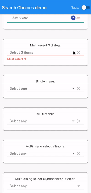
),Multi select 3 dialog
      SearchableDropdown.multiple(
        items: items,
        selectedItems: selectedItems,
        hint: "Select 3 items",
        searchHint: "Select 3",
        validator: (selectedItemsForValidator) {
          if (selectedItemsForValidator.length != 3) {
            return ("Must select 3");
          }
          return (null);
        },
        onChanged: (value) {
          setState(() {
            selectedItems = value;
          });
        },
        doneButton: (selectedItemsDone, doneContext) {
          return (RaisedButton(
              onPressed: selectedItemsDone.length != 3
                  ? null
                  : () {
                      Navigator.pop(doneContext);
                      setState(() {});
                    },
              child: Text("Save")));
        },
        closeButton: (selectedItems) {
          return (selectedItems.length == 3 ? "Ok" : null);
        },
        isExpanded: true,
      ),
Single menu
      SearchableDropdown.single(
        items: items,
        value: selectedValue,
        hint: "Select one",
        searchHint: null,
        onChanged: (value) {
          setState(() {
            selectedValue = value;
          });
        },
        dialogBox: false,
        isExpanded: true,
        menuConstraints: BoxConstraints.tight(Size.fromHeight(350)),
      ),
Multi menu
      SearchableDropdown.multiple(
        items: items,
        selectedItems: selectedItems,
        hint: "Select any",
        searchHint: "",
        doneButton: "Close",
        closeButton: SizedBox.shrink(),
        onChanged: (value) {
          setState(() {
            selectedItems = value;
          });
        },
        dialogBox: false,
        isExpanded: true,
        menuConstraints: BoxConstraints.tight(Size.fromHeight(350)),
      ),
Multi menu select all/none
      SearchableDropdown.multiple(
        items: items,
        selectedItems: selectedItems,
        hint: "Select any",
        searchHint: "Select any",
        onChanged: (value) {
          setState(() {
            selectedItems = value;
          });
        },
        dialogBox: false,
        closeButton: (selectedItemsClose) {
          return Row(
            mainAxisAlignment: MainAxisAlignment.spaceBetween,
            children: <Widget>[
              RaisedButton(
                  onPressed: () {
                    setState(() {
                      selectedItems.clear();
                      selectedItems.addAll(
                          Iterable<int>.generate(items.length).toList());
                    });
                  },
                  child: Text("Select all")),
              RaisedButton(
                  onPressed: () {
                    setState(() {
                      selectedItems.clear();
                    });
                  },
                  child: Text("Select none")),
            ],
          );
        },
        isExpanded: true,
        menuConstraints: BoxConstraints.tight(Size.fromHeight(350)),
      ),
Multi dialog select all/none without clear
      SearchableDropdown.multiple(
        items: items,
        selectedItems: selectedItems,
        hint: "Select any",
        searchHint: "Select any",
        displayClearIcon: false,
        onChanged: (value) {
          setState(() {
            selectedItems = value;
          });
        },
        dialogBox: true,
        closeButton: (selectedItemsClose) {
          return Row(
            mainAxisAlignment: MainAxisAlignment.spaceBetween,
            children: <Widget>[
              RaisedButton(
                  onPressed: () {
                    setState(() {
                      selectedItems.clear();
                      selectedItems.addAll(
                          Iterable<int>.generate(items.length).toList());
                    });
                  },
                  child: Text("Select all")),
              RaisedButton(
                  onPressed: () {
                    setState(() {
                      selectedItems.clear();
                    });
                  },
                  child: Text("Select none")),
            ],
          );
        },
        isExpanded: true,
      ),
Single dialog custom keyboard
      SearchableDropdown.single(
        items: Iterable<int>.generate(20).toList().map((i) {
          return (DropdownMenuItem(
            child: Text(i.toString()),
            value: i.toString(),
          ));
        }).toList(),
        value: selectedValue,
        hint: "Select one number",
        searchHint: "Select one number",
        onChanged: (value) {
          setState(() {
            selectedValue = value;
          });
        },
        dialogBox: true,
        keyboardType: TextInputType.number,
        isExpanded: true,
      ),
Single dialog object
      SearchableDropdown.single(
        items: ExampleNumber.list.map((exNum) {
          return (DropdownMenuItem(
              child: Text(exNum.numberString), value: exNum));
        }).toList(),
        value: selectedNumber,
        hint: "Select one number",
        searchHint: "Select one number",
        onChanged: (value) {
          setState(() {
            selectedNumber = value;
          });
        },
        dialogBox: true,
        isExpanded: true,
      ),
Single dialog overflow
SearchableDropdown.single(
items: [
DropdownMenuItem(
child: Text(
"way too long text for a smartphone at least one that goes in a normal sized pair of trousers but maybe not for a gigantic screen like there is one at my cousin's home in a very remote country where I
wouldn't want to go right now"),
value:
"way too long text for a smartphone at least one that goes in a normal sized pair of trousers but maybe not for a gigantic screen like there is one at my cousin's home in a very remote country where I
wouldn't want to go right now",
)
],
value: "",
hint: "Select one",
searchHint: "Select one",
onChanged: (value) {
setState(() {
selectedValue = value;
});
},
dialogBox: true,
isExpanded: true,
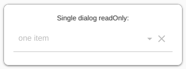
),Single dialog readOnly
SearchableDropdown.single(
items: [
DropdownMenuItem(
child: Text(
"one item"),
value:
"one item",
)
],
value: "one item",
hint: "Select one",
searchHint: "Select one",
disabledHint: "Disabled",
onChanged: (value) {
setState(() {
selectedValue = value;
});
},
dialogBox: true,
isExpanded: true,
readOnly: true,
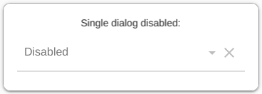
),Single dialog disabled
      SearchableDropdown.single(
        items: [
          DropdownMenuItem(
            child: Text(
                "one item"),
            value:
            "one item",
          )
        ],
        value: "one item",
        hint: "Select one",
        searchHint: "Select one",
        disabledHint: "Disabled",
        onChanged: null,
        dialogBox: true,
        isExpanded: true,
      ),
Feature requests/comments/questions/bugs
Feel free to log your feature requests/comments/questions/bugs here:
https://github.com/icemanbsi/searchable_dropdown/issues
Contributions
We would be happy to merge pull request proposals provided that:
- they don’t break the compilation
- they pass the automated testing
- they provide the relevant adaptations to documentation and automated testing
- they bring value
- they don’t completely transform the code
- they are readable (though, I enjoy https://www.ioccc.org/ as a contest full of curiosities)
Contributions and forks are very welcome!
In your pull request, feel free to add your line in the contributors section below:
Contributors
CI/CD
Continuous integration/deployment status: 
Source Code
Please Visit Flutter Searchable Dropdown Source Code at GitHub