
Responsive Widgets

This plugin helps to create responsive widgets, that makes auto-size with the proportion between reference screen size (width, height) with the screen that the app is running. The package only changed the original widgets, like "Container" to apply a function that make this calculation.
Important notes
Since the version 2.0.0, we started to use the package ScreenUtils (flutter_screenutils) to calculate all, have so many breaking changes, so if you used this package on the past, you will need stop using ResponsiveWidgets.getSize() and use the ScreenUtils that is inside of this package. For more informations about the use of this package, view the original docs of the package: https://pub.dev/packages/flutter_screenutil.
Basically now this package turned in a helper of this other package, helping to use more fast in the widgets and helping with the web version using the LayoutBuilder automatically when used ResponsiveWidgets.builder()
If you want use the previous version of the package, use the version 1.1.0 and in your pubspec.yaml: responsive_widgets: 1.1.0
Features
| Feature / Working with | Progress |
|---|---|
| Android | ✅ |
| iOS | ✅ |
| Smartphones | ✅ |
| 5.5 inch screens | ✅ |
| Vertical mode | ✅ |
| Horizontal mode | ✅ |
| Tablet | ✅ |
| Tablet on vertical mode | ✅ |
| Tablet on horizontal mode | ✅ |
| Support for web | ✅ |
Getting Started
First of all you need to use the code ResponsiveWidgets.init(context) to make the plugin works. Use ResponsiveWidgets.builder(child: ), to recalculate the proportion every time the sizes of device changes. Inclusive when the device turned to left/right… The code need to be placed on the first screen of the app, inside of the build method, like this: See also in code
    class  _HomeScreenState  extends  State<HomeScreen> {
        @override
        Widget  build(BuildContext context) {

            ResponsiveWidgets.init(context,
                height: 1920, // Optional
                width: 1080, // Optional
                allowFontScaling: true, // Optional
            );

            return  ResponsiveWidgets.builder(
                height: 1920, // Optional
                width: 1080, // Optional
                allowFontScaling: true, // Optional
                child: Scaffold(
                        body: Container()
                    ),
            );
        }
    }
Widgets
ContainerResponsive
    ContainerResponsive(
        child: Widget,
        height: double, // Responsive height
        heightResponsive: bool, // Enable/Disable Responsive height
        width: double, // Responsive width
        widthResponsive: , bool// Enable/Disable Responsive width
    )
SizedBoxResponsive
    SizedBoxResponsive(
        child: Widget,
        height: double, // Responsive height
        width: double, // Responsive width
    )
EdgeInsetsResponsive (Can be used in any widget with parameter padding)
    Padding(
        child: Widget,
        padding: EdgeInsetsResponsive.all(50), // EdgeInsets Responsive padding
    )
TextResponsive
    TextResponsive(
        text // Responsive fontSize
    )
RaisedButtonResponsive
    RaisedButtonResponsive(
        child: Widget,
        onPressed: (){}
    )
Function to recalculate size responsibly
Have special cases that doesn’t have Responsive Widgets created, one of this cases is the Positioned, to solve this problem is simple use this function that will return the correct value to the screen. Pass the px size of the design draft:
Adapted to screen width: ScreenUtil().setWidth(540),
Adapted to screen height: ScreenUtil().setHeight(200),
If your dart sdk>=2.6, you can use extension functions:
example:
instead of :
Container(
width: ScreenUtil().setWidth(50),
height:ScreenUtil().setHeight(200),
)
you can use it like this:
Container(
width: 50.w,
height:200.h
)
Adapter font:
//Incoming font size,the unit is pixel, fonts will not scale to respect Text Size accessibility settings
//(AllowallowFontScaling when initializing ScreenUtil)
ScreenUtil().setSp(28)
//Incoming font size,the unit is pixel,fonts will scale to respect Text Size accessibility settings
//(If somewhere does not follow the global allowFontScaling setting)
ScreenUtil().setSp(24, allowFontScalingSelf: true)
//for example:
Column(
              crossAxisAlignment: CrossAxisAlignment.start,
              children: <Widget>[
                Text(
                    'My font size is 24px on the design draft and will not change with the system.',
                    style: TextStyle(
                      color: Colors.black,
                      fontSize: ScreenUtil().setSp(24),
                    )),
                Text(
                    'My font size is 24px on the design draft and will change with the system.',
                    style: TextStyle(
                        color: Colors.black,
                        fontSize: ScreenUtil()
                            .setSp(24, allowFontScalingSelf: true))),
              ],
            )
Examples
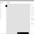
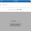
Mixed, responsive and normal, respectively

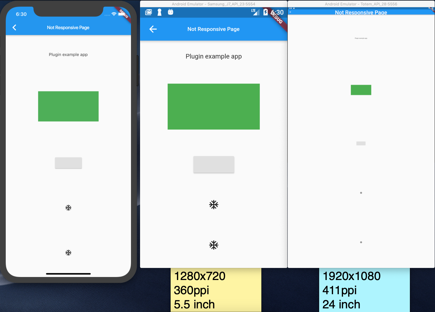
Not responsive page
Responsive page

Source Code
Please Visit [Flutter Responsive Widgets]() Source Code at GitHub