
progress_button
A Material Flutter Button that supports progress and error visuals
Getting Started
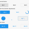
ProgressButton is designed to be easy to use and customizable. Without going into much detail, you can see a demo and example code below. What more do you need from a single class package??
-
First, add dependency to your pubspec.yaml
dependencies: progress_button: ^0.0.2 -
Second, add progress button to your widget tree
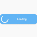
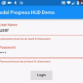
val progressButton = ProgressButton(
child: Text("Login"),
onPressed: VoidCallback,
buttonState: ButtonState.normal,
backgroundColor: Theme.of(context).primaryColor,
progressColor: Theme.of(context).primaryColor,
);
Of course you can change the buttonState anytime you want by using StreamBuilders and such. ProgressButton reacts accordingly to changes.
Source Code
Please Visit Flutter Progress Button Source Code at GitHub