
custom_radio
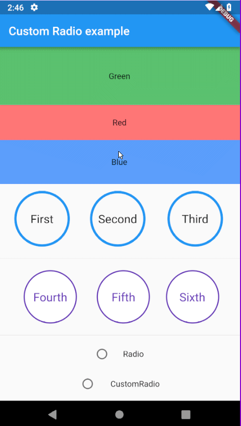
An animatable radio button that can be customized to the max.
I found it strange that flutter only provides two radio widgets: Radio and RadioListTile
The main issue with these widgets is that both of them force the use of the default Android leading animated circular icon.
This widget leaves everything up to the user by allowing them to provide their own builder function.
On top of that, an animations builder can also be provided. This gets passed a parent animation controller with which the user can then use to create a list of animations that can animate the widgets transition between states.
Installation
Simply add custom_radio: ^0.1.2 as a dependancy in your pubspec.yaml file.
Then import 'package:custom_radio/custom_radio.dart'; wherever you need it.
Examples
If only one animation type is required then it can be specified to enable stronger typing.
CustomRadio<String, double>(
  value: 'First',
  groupValue: widget.radioValue,
  duration: Duration(milliseconds: 500),
  animsBuilder: (AnimationController controller) => [
    CurvedAnimation(
      parent: controller,
      curve: Curves.easeInOut
    )
  ],
  builder: (BuildContext context, List<double> animValues, Function updateState, String value) {
    final alpha = (animValues[0] * 255).toInt();
    return GestureDetector(
      onTap: () {
        setState(() {
          widget.radioValue = value;
        });
      },
      child: Container(
        padding: EdgeInsets.all(32.0),
        margin: EdgeInsets.all(12.0),
        alignment: Alignment.center,
        decoration: BoxDecoration(
          shape: BoxShape.circle,
          color: Theme.of(context).primaryColor.withAlpha(alpha),
          border: Border.all(
            color: Theme.of(context).primaryColor.withAlpha(255 - alpha),
            width: 4.0,
          )
        ),
        child: Text(
          value,
          style: Theme.of(context).textTheme.body1.copyWith(fontSize: 24.0),
        )
      )
    );
  }
)
But any combination of animation types are supported.
CustomRadio<String, dynamic>(
  value: 'First',
  groupValue: widget.radioValue,
  animsBuilder: (AnimationController controller) => [
    CurvedAnimation(
      parent: controller,
      curve: Curves.easeInOut
    ),
    ColorTween(
      begin: Colors.white,
      end: Colors.deepPurple
    ).animate(controller),
    ColorTween(
      begin: Colors.deepPurple,
      end: Colors.white
    ).animate(controller),
  ],
  builder: (BuildContext context, List<dynamic> animValues, Function updateState, String value) {
    return GestureDetector(
      onTap: () {
        setState(() {
          widget.radioValue = value;
        });
      },
      child: Container(
        alignment: Alignment.center,
        margin: EdgeInsets.all(18.0),
        padding: EdgeInsets.all(32.0 + animValues[0] * 12.0),
        decoration: BoxDecoration(
          shape: BoxShape.circle,
          color: animValues[1],
          border: Border.all(
            color: animValues[2],
            width: 2.0
          )
        ),
        child: Text(
          value,
          style: Theme.of(context).textTheme.body1.copyWith(
            fontSize: 20.0,
            color: animValues[2]
          ),
        )
      )
    );
  },
)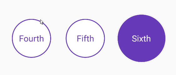
You can even recreate the default animation provided by Radio and add your own personal flairs!
Note: The full example can be found in the example directory
CustomRadio<int, double>(
  value: value,
  groupValue: widget.radioValue,
  duration: Duration(milliseconds: 400),
  animsBuilder: (AnimationController controller) => [
    CurvedAnimation(
      parent: controller,
      curve: Curves.ease
    )
  ],
  builder: ({ BuildContext context, List<double> animValues, Function updateState, bool checked }) {
    return GestureDetector(
      onTapDown: (TapDownDetails details) {
        setState(() {
          if (_controller.status != AnimationStatus.completed)
            _controller.forward();
        });
      },
      onTapUp: (TapUpDetails details) {
        setState(() {
          if (_controller.status != AnimationStatus.dismissed)
            _controller.reverse();
        });
      },
      onTap: () {
        setState(() {
          widget.radioValue = value;
        });
      },
      child: Container(
        margin: EdgeInsets.all(8.0),
        width: 38.0,
        height: 38.0,
        alignment: Alignment.center,
        decoration: BoxDecoration(
          shape: BoxShape.circle,
        ),
        child: Stack(
          alignment: Alignment.center,
          children: <Widget>[
            Container(
              width: 38.0 * _animation.value,
              height: 38.0 * _animation.value,
              decoration: BoxDecoration(
                shape: BoxShape.circle,
                color: Theme.of(context).primaryColor.withAlpha(40)
              ),
            ),
            Container(
              width: 18.0,
              height: 18.0,
              decoration: BoxDecoration(
                shape: BoxShape.circle,
                color: Colors.transparent,
                border: Border.all(
                  color: checked ? Theme.of(context).primaryColor : Theme.of(context).hintColor,
                  width: 2.0
                )
              ),
            ),
            Container(
              width: 11.0 * animValues[0],
              height: 11.0 * animValues[0],
              decoration: BoxDecoration(
                shape: BoxShape.circle,
                color: Theme.of(context).primaryColor,
              ),
            ),
          ]
        ),
      )
    );
  }
)
Source Code
Please Visit Flutter Custom Radio Button Source Code at GitHub