Flutter Layout Grid

A grid-based layout system for Flutter, optimized for user interface design, inspired by CSS Grid
Layout.
✨Featuring:✨
- Fixed, flexible, and content-based row and column sizing
- Precise control over placement of items if desired, including the ability to span rows, columns,
and overlap items - A configurable automatic grid item placement algorithm, capable of sparse and dense packing across
rows and columns - Right-to-left support, driven by ambient
Directionalityor configuation - Gutters!
Getting Started
All the terminology used in this library is shared with the CSS Grid Layout spec. If you’re
unfamiliar, I recommend taking a look at MDN’s glossary of grid
terms.
For inclusion in your pubspec, see
pub.dev.
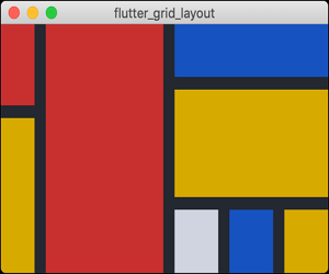
Example
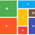
This is the source for the sample you can see above.
const cellRed = Color(0xffc73232);
const cellMustard = Color(0xffd7aa22);
const cellGrey = Color(0xffcfd4e0);
const cellBlue = Color(0xff1553be);
const background = Color(0xff242830);

class Piet extends StatelessWidget {
  @override
  Widget build(BuildContext context) {
    return Container(
      color: background,
      child: LayoutGrid(
        columnGap: 12,
        rowGap: 12,
        templateColumnSizes: [
          FlexibleTrackSize(1),
          FlexibleTrackSize(3.5),
          FlexibleTrackSize(1.3),
          FlexibleTrackSize(1.3),
          FlexibleTrackSize(1.3),
        ],
        templateRowSizes: [
          FlexibleTrackSize(1),
          FlexibleTrackSize(0.3),
          FlexibleTrackSize(1.5),
          FlexibleTrackSize(1.2),
        ],
        children: [
          // Column 1
          _buildItemForColor(cellRed).withGridPlacement(
            columnStart: 0,
            rowStart: 0,
            rowSpan: 2,
          ),
          _buildItemForColor(cellMustard).withGridPlacement(
            columnStart: 0,
            rowStart: 2,
            rowSpan: 2,
          ),
          // Column 2
          _buildItemForColor(cellRed).withGridPlacement(
            columnStart: 1,
            rowStart: 0,
            rowSpan: 4,
          ),
          // Column 3
          _buildItemForColor(cellBlue).withGridPlacement(
            columnStart: 2,
            columnSpan: 3,
            rowStart: 0,
          ),
          _buildItemForColor(cellMustard).withGridPlacement(
            columnStart: 2,
            columnSpan: 3,
            rowStart: 1,
            rowSpan: 2,
          ),
          _buildItemForColor(cellGrey).withGridPlacement(
            columnStart: 2,
            rowStart: 3,
          ),
          // Column 4
          _buildItemForColor(cellBlue).withGridPlacement(
            columnStart: 3,
            rowStart: 3,
          ),
          // Column 5
          _buildItemForColor(cellMustard).withGridPlacement(
            columnStart: 4,
            rowStart: 3,
          ),
        ],
      ),
    );
  }

  Widget _buildItemForColor(Color c) => SizedBox.expand(
        child: DecoratedBox(decoration: BoxDecoration(color: c)),
      );
}
Usage
Sizing of Columns and Rows
There are currently three way to size tracks (rows or columns):
FlexibleSizeTrack— consumes remaining space after the initial layout has completed.FixedSizeTrack— occupies a specific number of pixels on an axisIntrinsicContentTrackSize— sized to contain its items’ contents. Will also expand to fill
available space, onceFlexibleTrackSizetracks have been given the opportunity.
Technically, you could define your own, but I wouldn’t because the API will be evolving.
Placing widgets in the LayoutGrid
When an arbitrary widget is provided to LayoutGrid.children, it will be allotted a single cell and
placed automatically according to the LayoutGrid.autoPlacement algorithm (described
here).
LayoutGrid(
  templateColumnSizes = [/*...*/];
  templateRowSizes = [/*...*/];
  children: [
    MyWidget(), // Will occupy a 1x1 in the first vacant cell
  ],
)
Precise control over placement of an item is provided via the GridPlacement widget. You can think
of GridPlacement as the
Positioned equivalent for
LayoutGrid — it controls the where a widget is placed, and the cells it occupies.
LayoutGrid(
  templateColumnSizes = [/*...*/];
  templateRowSizes = [/*...*/];
  children: [
    GridPlacement(
      // All parameters optional
      columnStart: 1,
      columnSpan: 3,
      rowStart: 5,
      rowSpan: 2,
      child: MyWidget(),
    ),
  ],
)
Alternatively, GridPlacements can be created using the withGridPlacement
extension method on Widget. Using this method, the example above becomes:
LayoutGrid(
  templateColumnSizes = [/*...*/];
  templateRowSizes = [/*...*/];
  children: [
    MyWidget().withGridPlacement(
      // All parameters optional
      columnStart: 1,
      columnSpan: 3,
      rowStart: 5,
      rowSpan: 2,
    ),
  ],
)
All of the GridPlacement‘s constructor parameters are optional. It defaults to a 1×1 grid item
that will be placed automatically by the grid. Specifying positioning or spanning information (via
columnStart/columnSpan/rowStart/rowSpan parameters) will feed additional constraints into
its algorithm.
A definitely-placed item (meaning columnStart and rowStart have both been provided), will always
be placed precisely, even if it overlaps other definitely-placed items. Automatically-placed items
will flow around those that have been placed definitely.
Accessibility and Placement
Take note that the meaning you convey visually through placement may not be clear when presented
by assitive technologies, as Flutter defaults to exposing information in source order.
In situations where your semantic (visual) ordering differs from ordering in the source, the
ordering can be configured via the Semantics widget’s
sortKey parameter.
Differences from CSS Grid Layout
Things in CSS Grid Layout that are not supported:
- Negative row/column starts/ends. In CSS, these values refer to positions relative to the end of a
grid’s axis. - Any cells outside of the explicit grid. If an item is placed outside of the area defined by your
template rows/columns, we will throw an error. Support for automatic addition of rows and columns
to accommodate out of bound items is being considered. - minmax(), percentages, aspect ratios track sizing
- Named template areas, although they’re coming
Differences:
- In
flutter_layout_grid, flexible tracks do not account for their content’s base sizes as they do
in CSS. It’s expensive to measure, and I opted for speed. - Flexible tracks whose flex factors sum to < 1
Why not Slivers?
This library is not Sliver-based. I’d
considered it, but my use cases required the content-based sizing of rows and columns, and I didn’t
want to figure out the UI challenges associated with resizing tracks during scroll. I might be
interested in taking those on at some point.
Roadmap
- [ ] Tests!
- [ ] Named template areas, for friendlier item placement
- [ ] Improved track sizing, including minimum/maximums and aspect ratios
- [ ] The ability to specify row and column gaps at specific line locations via a delegate
- [ ] Implicit grid support (automatic growth along an axis as children are added)
- [ ] Performance improvements, as soon as I can get this profiler running(!!!)
Source Code
Please Visit Flutter Layout Grid Source Code at GitHub


