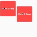

A flutter package which will help you to create a draggable widget that can be dragged around the screen.
Demo

Features 💚
- Manually Control the position of the widget along with drags.
- Automatically resizes itself when the widget changes
- Highly customizable
- Supports Flutter web as well
Properties 🔖
/// The widget that will be displayed as dragging widget
  final Widget child;

  /// The horizontal padding around the widget
  final double horizontalSapce;

  /// The vertical padding around the widget
  final double verticalSpace;

  /// Intial location of the widget, default to [AnchoringPosition.bottomRight]
  final AnchoringPosition initialPosition;

  /// Intially should the widget be visible or not, default to [true]
  final bool intialVisibility;

  /// The top bottom pargin to create the bottom boundary for the widget, for example if you have a [BottomNavigationBar],
  /// then you may need to set the bottom boundary so that the draggable button can't get on top of the [BottomNavigationBar]
  final double bottomMargin;

  /// The top bottom pargin to create the top boundary for the widget, for example if you have a [AppBar],
  /// then you may need to set the bottom boundary so that the draggable button can't get on top of the [AppBar]
  final double topMargin;

  /// Status bar's height, default to 24
  final double statusBarHeight;

  /// Shadow's border radius for the draggable widget, default to 10
  final double shadowBorderRadius;

  /// A drag controller to show/hide or move the widget around the screen
  final DragController dragController;

  /// [BoxShadow] when the widget is not being dragged, default to
  /// ```Dart
  ///const BoxShadow(
  ///     color: Colors.black38,
  ///    offset: Offset(0, 4),
  ///    blurRadius: 2,
  ///  ),
  /// ```

  final BoxShadow normalShadow;

  /// [BoxShadow] when the widget is being dragged
  ///```Dart
  ///const BoxShadow(
  ///     color: Colors.black38,
  ///    offset: Offset(0, 10),
  ///    blurRadius: 10,
  ///  ),
  /// ```
  final BoxShadow draggingShadow;

  /// How much should the [DraggableWidget] be scaled when it is being dragged, default to 1.1
  final double dragAnimationScale;
AnchoringPosition can be among these 4 types
enum AnchoringPosition {
  topLeft,
  topRight,
  bottomLeft,
  bottomRight,
}
How to use
Stack(
    children:[
        // other widgets...
         DraggableWidget(
            bottomMargin: 80,
            topMargin: 80,
            intialVisibility: true,
            horizontalSapce: 20,
            shadowBorderRadius: 50,
            child: Container(
              height: 100,
              width: 100,
              decoration: BoxDecoration(
                shape: BoxShape.circle,
                color: Colors.blue,
              ),
            ),
            initialPosition: AnchoringPosition.bottomLeft,
            dragController: dragController,
          )
    ]
)
DragController Fucntionality
/// Jump to any [AnchoringPosition] programatically
void jumpTo(AnchoringPosition anchoringPosition)

/// Get the current screen [Offset] of the widget
Offset getCurrentPosition()

/// Makes the widget visible
void showWidget()

/// Hide the widget
void hideWidget()
run the example app in the exmaple folder to find out more about how to use it.
Source Code
Please Visit Flutter Draggable Widget Source Code at GitHub


