


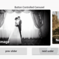
flutter_swiper
The best swiper for flutter , with multiple layouts, infinite loop. Compatible with Android & iOS.
New Features:Layout for pagination.
We are using this project flutter_page_indicator now .
New Features:PageTransformer
Finally, we have PageTransformer like android, just set a transformer to Swiper,
it returns a widget that has been transformed. For now, only support for layout DEFAULT.
Thanks to @FlutterRocks ,you’ve done great job 👏.
We are using this project transformer_page_view now .
New Features:Layout


Showcases


Roadmap
see:ROADMAP.md
Changelogs
see:CHANGELOG.md
Getting Started
Installation
Add
flutter_swiper : ^lastest_version
to your pubspec.yaml ,and run
flutter packages get in your project’s root directory.
Basic Usage
Create a new project with command
flutter create myappEdit lib/main.dart like this:
import 'package:flutter/material.dart';

import 'package:flutter_swiper/flutter_swiper.dart';

void main() => runApp(new MyApp());

class MyApp extends StatelessWidget {
  @override
  Widget build(BuildContext context) {
    return new MaterialApp(
      title: 'Flutter Demo',
      theme: new ThemeData(
        primarySwatch: Colors.blue,
      ),
      home: new MyHomePage(title: 'Flutter Demo Home Page'),
    );
  }
}

class MyHomePage extends StatefulWidget {
  MyHomePage({Key key, this.title}) : super(key: key);

  final String title;

  @override
  _MyHomePageState createState() => new _MyHomePageState();
}

class _MyHomePageState extends State<MyHomePage> {

  @override
  Widget build(BuildContext context) {
    return new Scaffold(
      appBar: new AppBar(
        title: new Text(widget.title),
      ),
    body:  new Swiper(
        itemBuilder: (BuildContext context,int index){
          return new Image.network("http://via.placeholder.com/350x150",fit: BoxFit.fill,);
        },
        itemCount: 3,
        pagination: new SwiperPagination(),
        control: new SwiperControl(),
      ),
    );
  }
}
Constructor
Basic
| Parameter | Default | Description |
|---|---|---|
| scrollDirection | Axis.horizontal | If Axis.horizontal, the scroll view’s children are arranged horizontally in a row instead of vertically in a column. |
| loop | true | Set to false to disable continuous loop mode. |
| index | 0 | Index number of initial slide. |
| autoplay | false | Set to true enable auto play mode. |
| onIndexChanged | void onIndexChanged(int index) | Called with the new index when the user swiped or autoplay |
| onTap | void onTap(int index) | Called when user tap ui. |
| duration | 300.0 | The milliscends of every transaction animation costs |
| pagination | null | set new SwiperPagination() to show default pagination |
| control | null | set new SwiperControl() to show default control buttons |
Pagination
The pagination extends from SwiperPlugin,the SwiperPlugin provides extra ui for Swiper.Set new SwiperPagination() to show default pagination.
| Parameter | Default | Description |
|---|---|---|
| alignment | Alignment.bottomCenter | Change this value if you what to put pagination in other place |
| margin | const EdgeInsets.all(10.0) | The distance between inner side of the parent container. |
| builder | SwiperPagination.dots | There are two default styles SwiperPagination.dots and SwiperPagination.fraction,both can be customized. |
If you’d like to customize your own pagination, you can do like this:
new Swiper(
    ...,
    pagination:new SwiperCustomPagination(
        builder:(BuildContext context, SwiperPluginConfig config){
            return new YourOwnPaginatipon();
        }
    )
);
Control buttons
The control also extends from SwiperPlugin,set new SwiperControl() to show default control buttons.
| Parameter | Default | Description |
|---|---|---|
| iconPrevious | Icons.arrow_back_ios | The icon data to display previous control button |
| iconNext | Icons.arrow_forward_ios | The icon data to display next. |
| color | Theme.of(context).primaryColor | Control button color |
| size | 30.0 | Control button size |
| padding | const EdgeInsets.all(5.0) | Control button padding |
Controller
The Controller is used to control the index of the Swiper, start or stop autoplay.You can create a controller by new SwiperController() and save the instance by futher usage.
| Method | Description |
|---|---|
| void move(int index, {bool animation: true}) | Move to the spicified index,with animation or not |
| void next({bool animation: true}) | Move to next |
| void previous({bool animation: true}) | Move to previous |
| void startAutoplay() | Start autoplay |
| void stopAutoplay() | Stop autoplay |
Autoplay
| Parameter | Default | Description |
|---|---|---|
| autoplayDelay | 3000 | Autoplay delay milliseconds. |
| autoplayDisableOnInteraction | true | If set true, autoplay is disabled when use swipes. |
Build in layouts
new Swiper(
  itemBuilder: (BuildContext context, int index) {
    return new Image.network(
      "http://via.placeholder.com/288x188",
      fit: BoxFit.fill,
    );
  },
  itemCount: 10,
  viewportFraction: 0.8,
  scale: 0.9,
)
new Swiper(
  itemBuilder: (BuildContext context, int index) {
    return new Image.network(
      "http://via.placeholder.com/288x188",
      fit: BoxFit.fill,
    );
  },
  itemCount: 10,
  itemWidth: 300.0,
  layout: SwiperLayout.STACK,
)
new Swiper(
    itemBuilder: (BuildContext context, int index) {
      return new Image.network(
        "http://via.placeholder.com/288x188",
        fit: BoxFit.fill,
      );
    },
    itemCount: 10,
    itemWidth: 300.0,
    itemHeight: 400.0,
    layout: SwiperLayout.TINDER,
 )
Very easy to create you own custom animation:
 new Swiper(
  layout: SwiperLayout.CUSTOM,
  customLayoutOption: new CustomLayoutOption(
      startIndex: -1,
      stateCount: 3
  ).addRotate([
    -45.0/180,
    0.0,
    45.0/180
  ]).addTranslate([
    new Offset(-370.0, -40.0),
    new Offset(0.0, 0.0),
    new Offset(370.0, -40.0)
  ]),
  itemWidth: 300.0,
  itemHeight: 200.0,
  itemBuilder: (context, index) {
    return new Container(
      color: Colors.grey,
      child: new Center(
        child: new Text("$index"),
      ),
    );
  },
  itemCount: 10)
The CustomLayoutOption is designed to describe animations.
It is very easy to specify every state of items in Swiper.
new CustomLayoutOption(
      startIndex: -1,  /// Which index is the first item of array below
      stateCount: 3    /// array length
  ).addRotate([        // rotation of every item
    -45.0/180,
    0.0,
    45.0/180
  ]).addTranslate([           /// offset of every item
    new Offset(-370.0, -40.0),
    new Offset(0.0, 0.0),
    new Offset(370.0, -40.0)
  ])
Codes
new ConstrainedBox(
  child: new Swiper(
    outer:false,
    itemBuilder: (c, i) {
      return new Wrap(
        runSpacing:  6.0,
        children: [0,1,2,3,4,5,6,7,8,9].map((i){
          return new SizedBox(
            width: MediaQuery.of(context).size.width/5,
            child: new Column(
              mainAxisSize: MainAxisSize.min,
              children: <Widget>[
                new SizedBox(
                  child:  new Container(
                    child: new Image.network("https://fuss10.elemecdn.com/c/db/d20d49e5029281b9b73db1c5ec6f9jpeg.jpeg%3FimageMogr/format/webp/thumbnail/!90x90r/gravity/Center/crop/90x90"),
                  ),
                  height: MediaQuery.of(context).size.width * 0.12,
                  width: MediaQuery.of(context).size.width * 0.12,
                ),
                new Padding(padding: new EdgeInsets.only(top:6.0),child: new Text("$i"),)
              ],
            ),
          );
        }).toList(),
      );
    },
    pagination: new SwiperPagination(
      margin: new EdgeInsets.all(5.0)
    ),
    itemCount: 10,
  ),
    constraints:new BoxConstraints.loose(new Size(screenWidth, 170.0))
),
You can find all custom options here:
https://github.com/jzoom/flutter_swiper/blob/master/example/lib/src/ExampleCustom.dart
Source Code
Please Visit Best Swiper for Flutter Source Code at GitHub