FlutterIconPicker
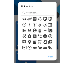
This package provides an IconPicker with supported Icons which can be picked through an AlertDialog. All Icons are mapped with its names in the IconData. This is necessary to make it possible to search through the icons. Fulltextsearch including a note if no results where found.
![]()
Supported IconPacks
| IconPack | Supported |
|---|---|
| Material | ✅ |
| Material Outline | ✅ |
| Cupertino | ✅ |
| FontAwesome | ✅ |
| LineAwesome | ✅ |
Usage
To use this package, add flutter_iconpicker as a dependency in your pubspec.yaml file.
API-Reference
| Parameter | Type | Default | Short decscription |
|---|---|---|---|
| context (only required) | BuildContext |
- |
Required due to AlertDialog‘s base. |
| adaptiveDialog | bool |
false |
If true, IconPicker will adapt depending on the screen size. If false, IconPicker will show itself inside an AlertDialog. |
| barrierDismissible | bool |
true |
Defines if the user can dismiss the dialog by tapping on the outside barrier. |
| iconSize | double |
40.0 |
Defines the size for the all icons, that can be picked. |
| iconColor | Color |
Theme.of(context).iconTheme.color |
Set the color for the all icons, that can be picked. |
| mainAxisSpacing | double |
5.0 |
How much space to place between children in a run in the main axis. |
| crossAxisSpacing | double |
5.0 |
How much space to place between children in a run in the cross axis. |
| iconPickerShape | ShapeBorder |
RoundedRectangleBorder(borderRadius: BorderRadius.circular(5.0)) |
The dialogs shape for the picker. |
| backgroundColor | Color |
Theme.of(context).dialogBackgroundColor |
The color for the AlertDialog’s background color. |
| constraints | BoxConstraints |
If adaptiveDialog == true then it’s default is: BoxConstraints(maxHeight: 500, minWidth: 450, maxWidth: 720), otherwise: BoxConstraints(maxHeight: 350, minWidth: 450, maxWidth: 678). |
The dialogs BoxConstraints for limiting/setting: maxHeight, maxWidth, minHeight and minWidth. |
| title | Widget |
Text('Pick an icon') |
The title for the Picker. Sits above the [SearchBar] and [Icons]. |
| closeChild | Widget |
Text('Close',textScaleFactor: 1.25,) |
The content for the AlertDialog‘s action FlatButton which closes the default dialog. |
| searchIcon | Icon |
Icon(Icons.search) |
Sets the prefix icon in the [SearchBar] |
| searchHintText | String |
'Search' |
Sets the hintText in the TextField of [SearchBar] |
| searchClearIcon | Icon |
Icon(Icons.close) |
Sets the suffix icon in the [SearchBar] |
| noResultsText | String |
'No results for:' |
The text to show when no results where found for the search term. |
| showTooltips | bool |
false |
Shows the labels underneeth the proper icon. WARNING for Flutter Web: Until SKIA is disabled (like Flutter Web isn’t ready for SKIA yet), this option could slow down the performance! |
| iconPackMode | IconPack |
IconPack.material |
The mode which Icons to show. |
[New] IconPackMode
You can now select the wished IconPack through the new argument: iconPackMode. This defaults to IconPack.material.
For further usage have a look in the example.
Result of IconPicker and further usage (saving and retreiving)
The picker is returning (as shown in the example method _pickIcon() underneeth) an IconData which is nothing else then this class for example:
IconData(0xe3af, fontFamily: 'MaterialIcons'); // Icons.camerathat’s representing an Material icon.
So if you plan to save the picked icon anywhere (sqflite, firebase, etc.), you can use the serialization methods:
- Call this to convert the picked IconData to a Map:
IconData to Map
iconDataToMap(iconData)- You can retreive the IconData by passing the mapped IconData:
Map to IconData
mapToIconData(map)Example
import 'package:flutter/material.dart';
import 'package:flutter_iconpicker/flutter_iconpicker.dart';

void main() {
  runApp(MaterialApp(
    home: HomeScreen()
  ));
}

class HomeScreen extends StatefulWidget {
  HomeScreen({Key key}) : super(key: key);

  @override
  _HomeScreenState createState() => _HomeScreenState();
}

class _HomeScreenState extends State<HomeScreen> {
  Icon _icon;

_pickIcon() async {
  IconData icon = await FlutterIconPicker.showIconPicker(context, iconPackMode: IconPack.cupertino);

  _icon = Icon(icon);
  setState((){});

  debugPrint('Picked Icon:  $icon');
}

  @override
  Widget build(BuildContext context) {
    return Scaffold(
      body: Center(
      child: Column(
        mainAxisAlignment: MainAxisAlignment.center,
        crossAxisAlignment: CrossAxisAlignment.center,
        children: <Widget>[
          RaisedButton(
            onPressed: _pickIcon,
            child: Text('Open IconPicker'),
          ),
          SizedBox(height: 10),
          AnimatedSwitcher(
            duration: Duration(milliseconds: 300),
            child: _icon != null ? _icon : Container()
          )
        ])
      ),
    );
  }
}
Source Code
Please Visit Flutter Icon Picker Source Code at GitHub


