
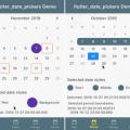
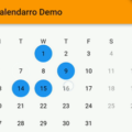
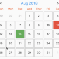
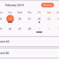
horizontal_calendar


Easy to use, highly customizable horizontal calendar.
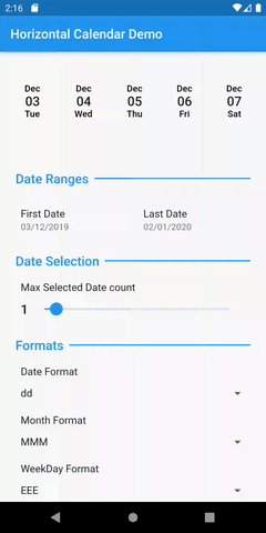
Features
[x] Custom date range (First & Last Date)
[x] Single or up to x days selection
[x] onDateSelected, onDateUnSelected, onDateLongTap, onMaxDateSelectionReached events.
[x] Support custom ScrollController
[x] Initial selected dates
[x] Granular control to disable dates.
[x] Internationalization support
[x] Month / Date / Week Day label order customization
[x] Month / Week day label hide / show
[x] Custom TextStyles for Month, Date, WeekDay
[x] Custom TextStyles for selected Month, selected Date, selected WeekDay
[x] Customizable month format (e.g. MM,MMM)
[x] Customizable date format (e.g. dd,d)
[x] Customizable week day format (e.g. EE,EEE)
[x] Default date cell Decoration
[x] Selected date cell Decoration
[x] Disabled date cell Decoration
Properties
| Property Name | Property Type | Description | Default value |
|---|---|---|---|
| height | double | Height of widget | 100 |
| firstDate | DateTime | First Date of calendar | – |
| lastDate | DateTime | Last Date of calendar | – |
| maxSelectedDateCount | int | Count of max selectable dates | 1 |
| onDateSelected | Function(DateTime dateTime) | Callback when date is selected | – |
| onDateLongTap | Function(DateTime dateTime) | Callback when date cell is long pressed | – |
| onDateUnSelected | Function(DateTime dateTime) | Callback when date is unselected | – |
| onMaxDateSelectionReached | VoidCallback | Callback when max date selection count is reached | – |
| initialSelectedDates | List<DateTime> | List of initially selected dates | Empty List |
| isDateDisabled | bool Function(DateTime dateTime) | Function that returns bool to check if particular date is disabled | – |
| labelOrder | List<LabelType> | Order of labels | [ LabelType.month, LabelType.date, LabelType.weekday] |
| scrollController | ScrollController | Scroll Controller of horizontal list | – |
| monthTextStyle | TextStyle | Month label TextStyle | titleTheme |
| selectedMonthTextStyle | TextStyle | Selected Month label TextStyle | monthTextStyle |
| monthFormat | String | Format of month | MMM |
| dateTextStyle | TextStyle | Date label TextStyle | subTitleTheme |
| selectedDateTextStyle | TextStyle | Selected Date label TextStyle | dateTextStyle |
| dateFormat | String | Format of date | dd |
| weekDayTextStyle | TextStyle | Week day label TextStyle | subTitleTheme |
| selectedWeekDayTextStyle | TextStyle | Selected Week day label TextStyle | dateTextStyle |
| weekDayFormat | String | Format of week day | EEE |
| defaultDecoration | Decoration | Default Decoration to be applied to date cell | – |
| selectedDecoration | Decoration | Decoration to be applied to selected date cell | – |
| disabledDecoration | Decoration | Decoration to be applied to disabled date cell | – |
| spacingBetweenDates | double | Spacing between two cells of date | 8.0 |
| padding | EdgeInsetsGeometry | Padding to date cell | EdgeInsets.all(8.0) |
State Management in horizontal_calendar
initialSelectedDates will only be taken when the widget built for the first time. horizontal_calendar will manage the Subsequent dates selection and un selection.
To get the initial control over the host app, one can pass the UniqueKey.
e.g.
    HorizontalCalendar(
      key: UniqueKey(),
    );
Issues and Feedback
- For any issue and feedback please create issue on Github repo.
Source Code
Please Visit Flutter Horizontal Calendar Source Code at GitHub