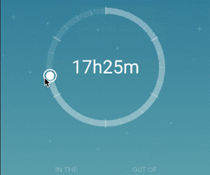
flutter_circular_slider
A customizable circular slider for Flutter.
Getting Started
Installation
Add
flutter_circular_slider : ^lastest_version
to your pubspec.yaml, and run
flutter packages getin your project’s root directory.
Basic Usage
Create a new project with command
flutter create myappEdit lib/main.dart like this:
import 'package:flutter/material.dart';

import 'package:flutter_circular_slider/flutter_circular_slider.dart';

void main() => runApp(MyApp());

class MyApp extends StatelessWidget {
  @override
  Widget build(BuildContext context) {
    return MaterialApp(
      theme: ThemeData(
        primarySwatch: Colors.blue,
      ),
      home: MyHomePage(),
    );
  }
}

class MyHomePage extends StatelessWidget {
  @override
  Widget build(BuildContext context) {
    return Scaffold(
        backgroundColor: Colors.blueGrey,
        body: Center(
          child: Container(child: DoubleCircularSlider(100, 0, 20)),
        ));
  }
}
There are two different options:
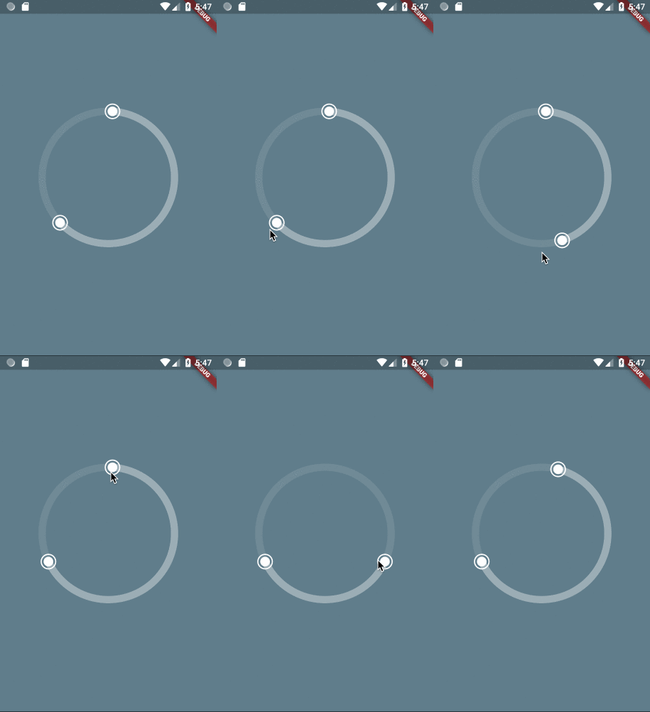
- SingleCircularSlider: has only one handler and can be moved either dragging the handler or just by clicking on different parts of the slider.
- DoubleCircularSlider: has two handlers and both have to be moved by dragging them.
Constructor
| Parameter | Default | Description |
|---|---|---|
| divisions | The number of sections in which the circle will be divided for selection. | |
| init | (Only for DoubleCircularSlider) The initial value in the selection. Has to be bigger than 0 and smaller than divisions. | |
| end | (Only for DoubleCircularSlider) The end value in the selection. Has to be bigger than 0 and smaller than divisions. | |
| position | (Only for SingleCircularSlider) The selection. Has to be bigger than 0 and smaller than divisions. | |
| height | 220.0 | Height of the canvas where the slider is rendered. |
| width | 220.0 | Width of the canvas where the slider is rendered. |
| primarySectors | 0 | Number of sectors painted in the base circle. Painted in selectionColor. |
| secondarySectors | 0 | Number of secondary sectors painted in the base circle. Painted in baseColor. |
| child | null | Widget that will be inserted in the center of the circular slider. |
| onSelectionChange | void onSelectionChange(int init, int end, int laps) | Triggered every time the user interacts with the slider and changes the init and end values, and also laps. |
| onSelectionEnd | void onSelectionEnd(int init, int end, int laps) | Triggered every time the user finish one interaction with the slider. |
| baseColor | Color.fromRGBO(255, 255, 255, 0.1) | The color used for the base of the circle. |
| selectionColor | Color.fromRGBO(255, 255, 255, 0.3) | The color used for the selection in the circle. |
| handlerColor | Colors.white | The color used for the handlers. |
| handlerOutterRadius | 12.0 | The radius for the outter circle around the handler. |
| showRoundedCapInSelection | false | (Only for SingleCircularSlider) Shows a rounded cap at the edge of the selection slider with no handler. |
| showHandlerOutter | true | If true will display an extra ring around the handlers. |
| sliderStrokeWidth | 12.0 | The stroke width for the slider (thickness). |
| shouldCountLaps | false | If true, onSelectionChange will also return the updated number of laps. |
Use Cases
Move complete selection
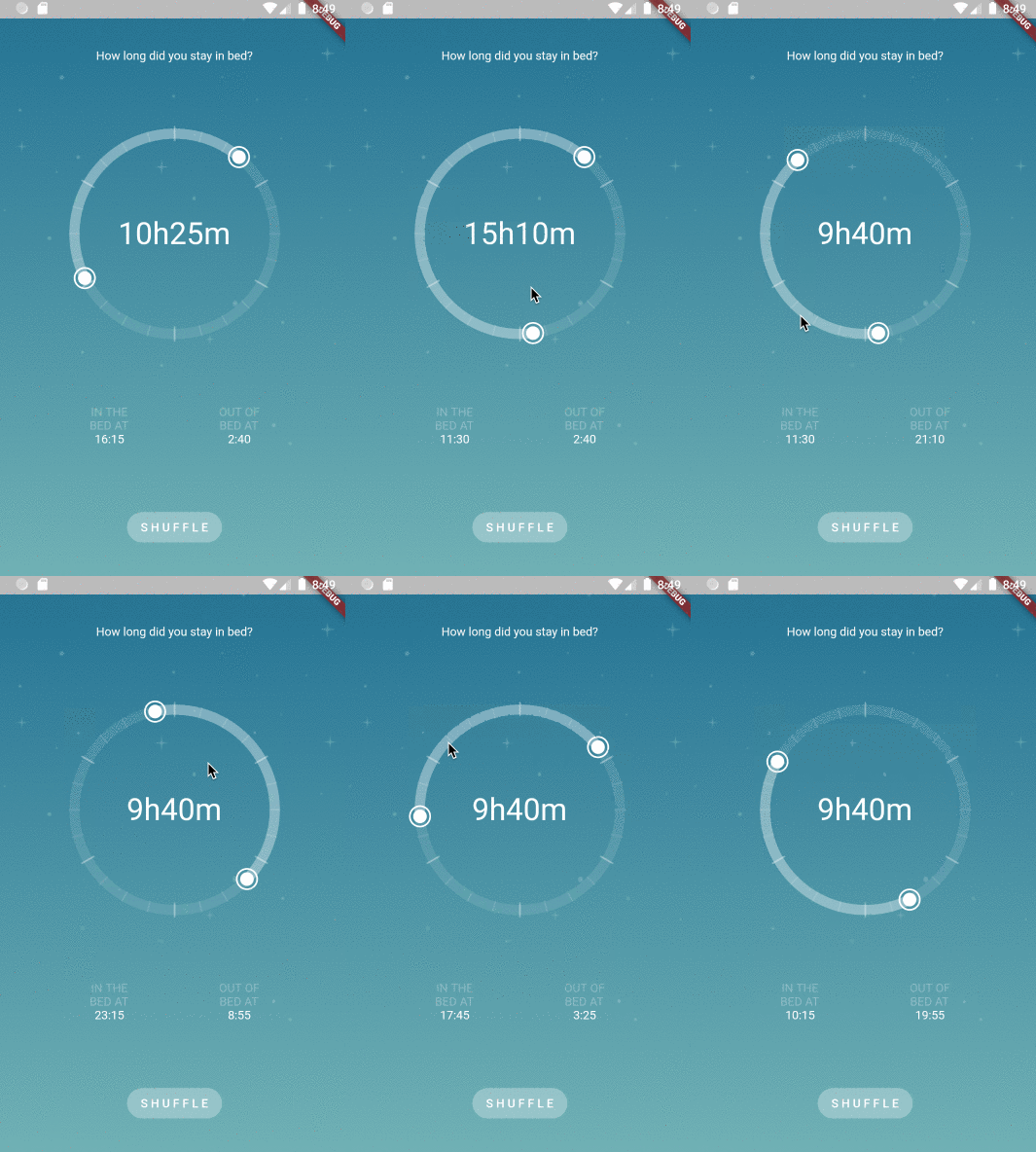
Single Handler
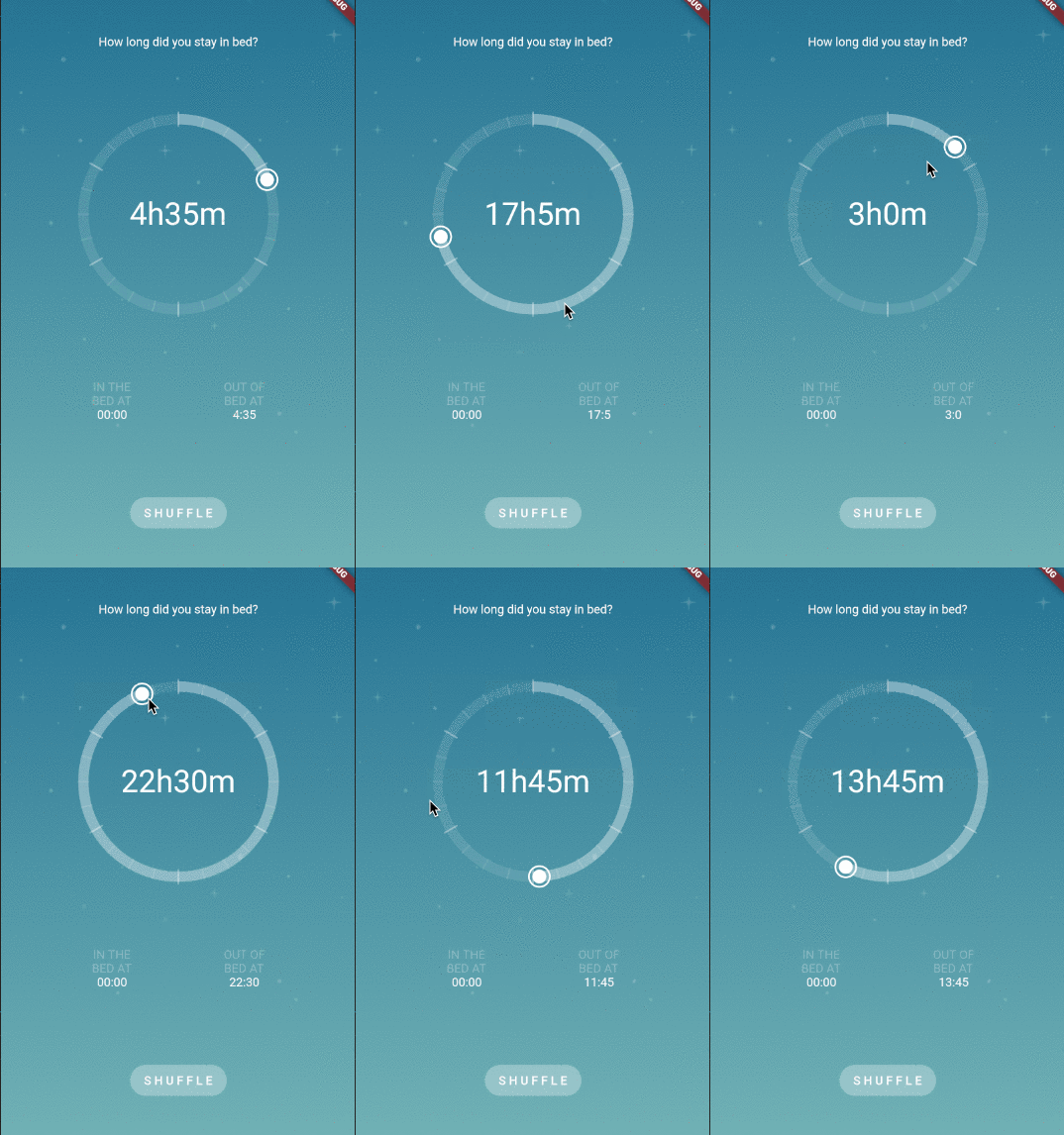
Laps
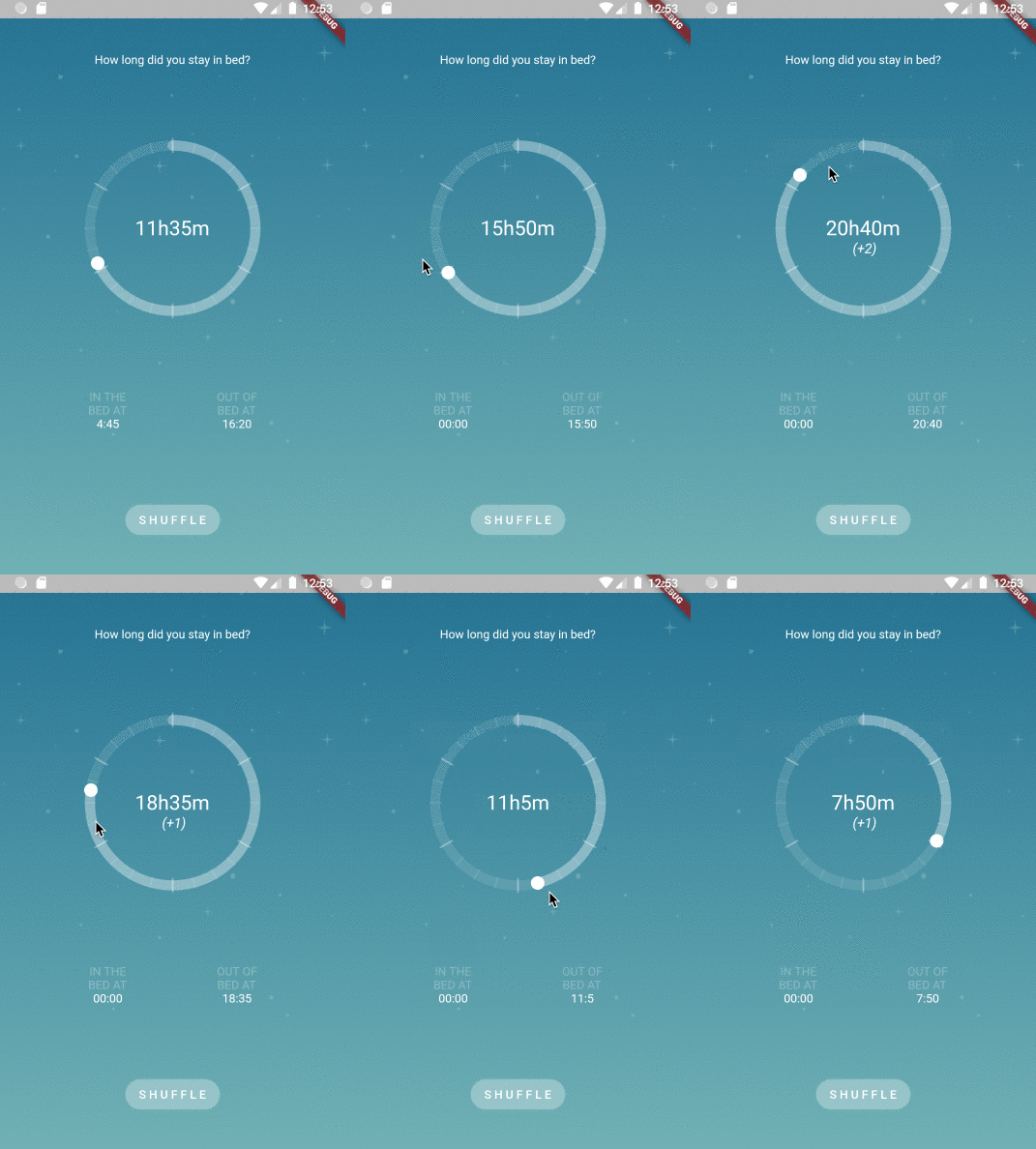
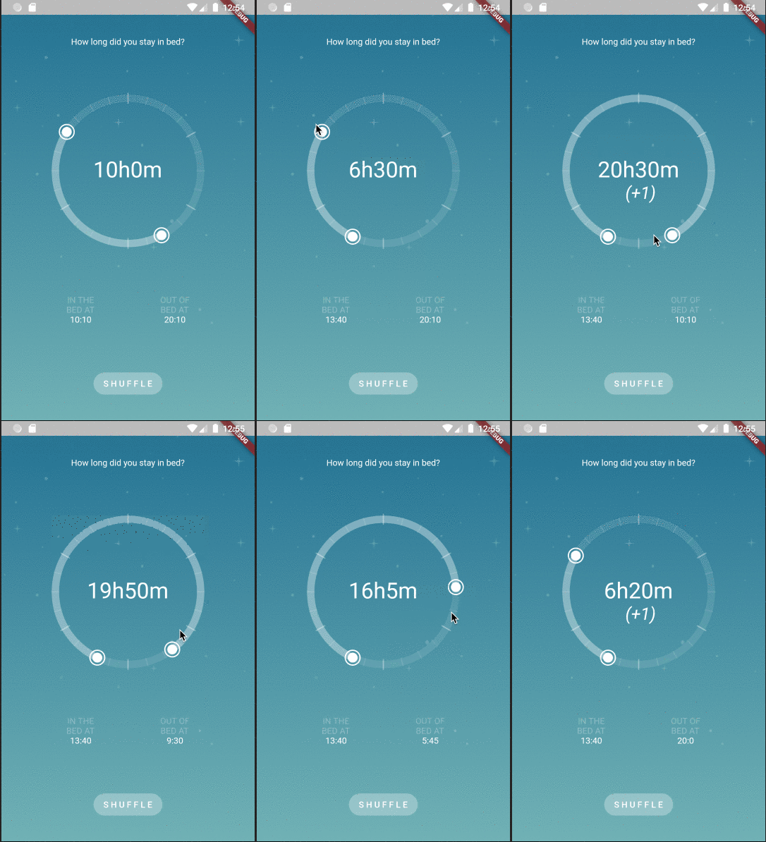
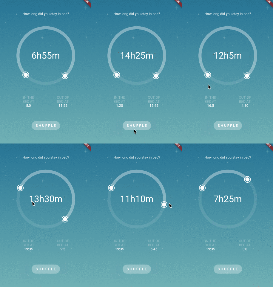
Sleep Time Selection
import 'dart:math';

import 'package:flutter/material.dart';

import 'package:flutter_circular_slider/flutter_circular_slider.dart';

void main() => runApp(MyApp());

class MyApp extends StatelessWidget {
  @override
  Widget build(BuildContext context) {
    return MaterialApp(
      theme: ThemeData(
        primarySwatch: Colors.blue,
      ),
      home: MyHomePage(),
    );
  }
}

class MyHomePage extends StatelessWidget {
  @override
  Widget build(BuildContext context) {
    return Scaffold(
        body: SafeArea(
      child: Container(
          decoration: BoxDecoration(
            image: DecorationImage(
              image: AssetImage('images/background_morning.png'),
              fit: BoxFit.cover,
            ),
          ),
          child: SleepPage()),
    ));
  }
}

class SleepPage extends StatefulWidget {
  @override
  _SleepPageState createState() => _SleepPageState();
}

class _SleepPageState extends State<SleepPage> {
  final baseColor = Color.fromRGBO(255, 255, 255, 0.3);

  int initTime;
  int endTime;

  int inBedTime;
  int outBedTime;

  @override
  void initState() {
    super.initState();
    _shuffle();
  }

  void _shuffle() {
    setState(() {
      initTime = _generateRandomTime();
      endTime = _generateRandomTime();
      inBedTime = initTime;
      outBedTime = endTime;
    });
  }

  void _updateLabels(int init, int end) {
    setState(() {
      inBedTime = init;
      outBedTime = end;
    });
  }

  @override
  Widget build(BuildContext context) {
    return Column(
      mainAxisAlignment: MainAxisAlignment.spaceEvenly,
      children: [
        Text(
          'How long did you stay in bed?',
          style: TextStyle(color: Colors.white),
        ),
        DoubleCircularSlider(
          288,
          initTime,
          endTime,
          height: 260.0,
          width: 260.0,
          primarySectors: 6,
          secondarySectors: 24,
          baseColor: Color.fromRGBO(255, 255, 255, 0.1),
          selectionColor: baseColor,
          handlerColor: Colors.white,
          handlerOutterRadius: 12.0,
          onSelectionChange: _updateLabels,
          sliderStrokeWidth: 12.0,
          child: Padding(
            padding: const EdgeInsets.all(42.0),
            child: Center(
                child: Text('${_formatIntervalTime(inBedTime, outBedTime)}',
                    style: TextStyle(fontSize: 36.0, color: Colors.white))),
          ),
        ),
        Row(mainAxisAlignment: MainAxisAlignment.spaceEvenly, children: [
          _formatBedTime('IN THE', inBedTime),
          _formatBedTime('OUT OF', outBedTime),
        ]),
        FlatButton(
          child: Text('S H U F F L E'),
          color: baseColor,
          textColor: Colors.white,
          shape: RoundedRectangleBorder(
            borderRadius: BorderRadius.circular(50.0),
          ),
          onPressed: _shuffle,
        ),
      ],
    );
  }

  Widget _formatBedTime(String pre, int time) {
    return Column(
      children: [
        Text(pre, style: TextStyle(color: baseColor)),
        Text('BED AT', style: TextStyle(color: baseColor)),
        Text(
          '${_formatTime(time)}',
          style: TextStyle(color: Colors.white),
        )
      ],
    );
  }

  String _formatTime(int time) {
    if (time == 0 || time == null) {
      return '00:00';
    }
    var hours = time ~/ 12;
    var minutes = (time % 12) * 5;
    return '$hours:$minutes';
  }

  String _formatIntervalTime(int init, int end) {
    var sleepTime = end > init ? end - init : 288 - init + end;
    var hours = sleepTime ~/ 12;
    var minutes = (sleepTime % 12) * 5;
    return '${hours}h${minutes}m';
  }

  int _generateRandomTime() => Random().nextInt(288);
}
Source Code
Please Visit Flutter Circular Slider Source Code at GitHub


